How To Make Floating Action Button (FAB) - Material Design Tutorial

In this tutorial, we are going to learn how to implement the Floating Action Button (a.k.a FAB) which is one of the newest component brought into android with the introduction of material design. Floating Action Button is the button which prompts the main task of your application and is not compulsory to add FAB to your app if you want to avoid the FAB you are free to do that as well, FAB as said earlier is used to access the main task of the app for example a video player app will use FAB to play the videos, Social network app will use the FAB to post status, photos etc. With all that explained let's begin the tutorial.

Prerequisites


To Demonstrate how to make the Floating Action Button, I would be using the Toolbar project I made previously, you can check the Toolbar project here. If you are already aware of building toolbar then you can directly jump into the project.

To implement the Floating Action Button (FAB) from scratch we would be building a custom drawable, it is required that you understand how drawable works in android, especially layer-list. If you are not familiar with drawables don't worry I would be explaining as much as I can.

Requirments

Android Studio 1.0.1 (Version I am using)

Icon for the FAB

That's it, noting else.


Let's Understand How the Floating Action Button (FAB) Can Be Implemented


I would be showing you two ways of building Floating Action Button.

1. Building FAB from scratch with custom drawable.

2. Building FAB from available libraries and best FAB libraries.  (Coming soon)

Using libraries is the simplest way and as you are always going to need the FAB from now on you should probably get familiar with one of the library and start implementing FAB with it. 

But sometimes when you have very specific need and you need complete control over your FAB then you have to build it from scratch.


Building Floating Action Button From Scratch with custom drawables.

So for making a custom FAB follow the steps as shown below. after you complete the following steps your result would look something like this. 


Step 1. Start android studio, create a new blank project. Now before we do anything we need to first make custom circle shape drawable. to do that, go to  res ->  drawable right-click and create a new drawable resource and name it circle.xml. Now in the newly created file add the following code.
<?xml version="1.0" encoding="utf-8"?>
<layer-list xmlns:android="http://schemas.android.com/apk/res/android">

    <item android:top="8px">
        <layer-list>
            <item>
                <shape android:shape="oval">
                    <solid android:color="#08000000"/>
                    <padding
                        android:bottom="3px"
                        android:left="3px"
                        android:right="3px"
                        android:top="3px"
                        />
                </shape>
            </item>
            <item>
                <shape android:shape="oval">
                    <solid android:color="#09000000"/>
                    <padding
                        android:bottom="2px"
                        android:left="2px"
                        android:right="2px"
                        android:top="2px"
                        />
                </shape>
            </item>
            <item>
                <shape android:shape="oval">
                    <solid android:color="#10000000"/>
                    <padding
                        android:bottom="2px"
                        android:left="2px"
                        android:right="2px"
                        android:top="2px"
                        />
                </shape>
            </item>
            <item>
                <shape android:shape="oval">
                    <solid android:color="#11000000"/>
                    <padding
                        android:bottom="1px"
                        android:left="1px"
                        android:right="1px"
                        android:top="1px"
                        />
                </shape>
            </item>
            <item>
                <shape android:shape="oval">
                    <solid android:color="#12000000"/>
                    <padding
                        android:bottom="1px"
                        android:left="1px"
                        android:right="1px"
                        android:top="1px"
                        />
                </shape>
            </item>
            <item>
                <shape android:shape="oval">
                    <solid android:color="#13000000"/>
                    <padding
                        android:bottom="1px"
                        android:left="1px"
                        android:right="1px"
                        android:top="1px"
                        />
                </shape>
            </item>
            <item>
                <shape android:shape="oval">
                    <solid android:color="#14000000"/>
                    <padding
                        android:bottom="1px"
                        android:left="1px"
                        android:right="1px"
                        android:top="1px"
                        />
                </shape>
            </item>
            <item>
                <shape android:shape="oval">
                    <solid android:color="#15000000"/>
                    <padding
                        android:bottom="1px"
                        android:left="1px"
                        android:right="1px"
                        android:top="1px"
                        />
                </shape>
            </item>

        </layer-list>
    </item>

    <item >

        <ripple xmlns:android="http://schemas.android.com/apk/res/android"
            android:color="?android:colorControlHighlight">
            <item android:id="@android:id/mask">
                <shape android:shape="oval">
                    <solid android:color="#FFBB00" />
                </shape>
            </item>
            <item>
                <shape android:shape="oval">

                    <solid android:color="@color/ColorPrimary" />


                </shape>
            </item>
        </ripple>

    </item>


</layer-list>

Now what we have done in the above xml drawable is we have created structure like this.

<layer-list>
      <Item>
                <layer-list>
                 
                 <item> (Layer of shadow)
                 <item>
                 <item>
                 <item>
                   .....
                </layer-list>
       </Item>
       
         <Item>
         
                 <shape> (Oval shape)
                 </shape>

       </Item>

<layer-list>


we have created the drawable by defining layers the root layer consists of 2 items

1. layers of shadows
2. circular shape;

You must notice that the circular shape is enclosed in a ripple tag this tag ensures the circle reacts to on touch with the ripple effect on lollipop devices.

Now if you set the circle.xml as background of any view it will form a cirlce. we are going to use this circle as background to image-button view.

Step 2. Now go to res -> layout right-click and select create a new layout resource, name it tool_bar.xml and the add the following code to that file. (Everything about toolbar is explained in my previous posts )

<?xml version="1.0" encoding="utf-8"?>

<android.support.v7.widget.Toolbar
    android:layout_height="wrap_content"
    android:layout_width="match_parent"
    android:elevation="2dp"
    android:theme="@style/Base.ThemeOverlay.AppCompat.Dark"
    android:background="@color/ColorPrimary"
    xmlns:android="http://schemas.android.com/apk/res/android" />

Step 3. Now go to res -> values create a new resource file name it colors.xml and add the following code.
<?xml version="1.0" encoding="utf-8"?>
<resources>
    <color name="ColorPrimary">#FF5722</color>
    <color name="ColorPrimaryDark">#E64A19</color>
</resources>

Everything about colors is explained in previous posts, make sure you go through it if you dont understand.

Step 4. Now go to activity_main.xml and add the following code to it. also make sure you add the icon which you want to show inside your FAB to your project. I have downloaded the icon from www.icons4android.com and named it ic_action, and added it to the drawables folder of the project
<RelativeLayout xmlns:android="http://schemas.android.com/apk/res/android"
    xmlns:tools="http://schemas.android.com/tools"
    android:layout_width="match_parent"
    android:layout_height="match_parent"
    tools:context=".MainActivity">

    <include
        android:id="@+id/toolbar"
        layout="@layout/tool_bar"

        ></include>

    <FrameLayout
        android:layout_width="match_parent"
        android:layout_height="match_parent"
        android:layout_alignParentEnd="true"
        android:layout_alignParentRight="true"
        android:layout_alignParentTop="true"
        android:id="@+id/frameLayout">

        <TextView
            android:id="@+id/TextAct1"
            android:layout_width="wrap_content"
            android:layout_height="wrap_content"
            android:layout_alignParentLeft="true"
            android:layout_alignParentStart="true"
            android:layout_centerVertical="true"
            android:layout_gravity="center"
            android:text="This is the first Activity, Say Hi"
            android:textSize="25dp" />

        <ImageButton
            android:layout_margin="15dp"
            android:layout_width="70dp"
            android:layout_height="70dp"
            android:src="@drawable/ic_action"
            android:background="@drawable/circle"
            android:id="@+id/imageButton"
            android:layout_gravity="right|bottom" />


    </FrameLayout>
</RelativeLayout>

The structure of activiy_main.xml is pretty self explanatory. There is a FrameLayout inside a RelativeLayout, also inside the frame layout I have added a Text View and an ImageButton. Notice that the background of imageButton is set to "@drawable/circle", width and height of the imageButton is same to make it form into a circle and src of imageButton is set to "@drawable/ic_action" which the icon I have downloaded and added to my project.

Step 5. Now go to your MainActivity.java and add the following code to it.

package com.example.hp1.floatingactionbuttonfab;

import android.content.Intent;
import android.support.v7.app.ActionBarActivity;
import android.os.Bundle;
import android.support.v7.widget.Toolbar;
import android.view.Menu;
import android.view.MenuItem;
import android.view.View;
import android.widget.ImageButton;
import android.widget.Toast;


public class MainActivity extends ActionBarActivity {

    Toolbar toolbar;
    ImageButton FAB;

    @Override
    protected void onCreate(Bundle savedInstanceState) {
        super.onCreate(savedInstanceState);
        setContentView(R.layout.activity_main);

        toolbar = (Toolbar) findViewById(R.id.toolbar);
        setSupportActionBar(toolbar);

        FAB = (ImageButton) findViewById(R.id.imageButton);
        FAB.setOnClickListener(new View.OnClickListener() {
            @Override
            public void onClick(View v) {

                
                Toast.makeText(MainActivity.this,"Hello Worl",Toast.LENGTH_SHORT).show();
                

            }
        });
    }


    @Override
    public boolean onCreateOptionsMenu(Menu menu) {
        // Inflate the menu; this adds items to the action bar if it is present.
        getMenuInflater().inflate(R.menu.menu_main, menu);
        return true;
    }

    @Override
    public boolean onOptionsItemSelected(MenuItem item) {
        // Handle action bar item clicks here. The action bar will
        // automatically handle clicks on the Home/Up button, so long
        // as you specify a parent activity in AndroidManifest.xml.
        int id = item.getItemId();

        //noinspection SimplifiableIfStatement
        if (id == R.id.action_settings) {
            return true;
        }

        return super.onOptionsItemSelected(item);
    }
}


So If you run your app at this stage you would get something like this.
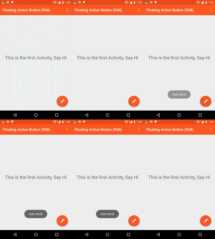


Pretty good, When you click on the FAB a toast message appears saying "Hello World". But we want some action to be performed when the user clicks the Floating Action Button, just to keep the tutorial simple I am going to start a new activity when the FAB is clicked. So let's start with that now.

Step 6. Go to java -> [package-name]  right-click and select new -> activity -> blank activity give your activity name as SecondActivity and layout name as activity_second.xml. now go to activity_second.xml and add the following code to it.
<?xml version="1.0" encoding="utf-8"?>
<RelativeLayout xmlns:android="http://schemas.android.com/apk/res/android"
    android:layout_width="match_parent"
    android:layout_height="match_parent"
    android:orientation="vertical"
    >


    <include
        android:id="@+id/toolbar"
        layout="@layout/tool_bar"

        ></include>

    <LinearLayout
        android:layout_below="@id/toolbar"
        android:layout_width="match_parent"
        android:layout_height="match_parent"
        android:orientation="vertical">

        <TextView
            android:layout_marginTop="10dp"
            android:textColor="#000000"
            android:textSize="25dp"
            android:layout_width="242dp"
            android:layout_height="wrap_content"
            android:text="Enter Your Details"
            android:id="@+id/details"
            android:layout_gravity="center_horizontal" />

        <TextView
            android:layout_width="wrap_content"
            android:layout_height="wrap_content"
            android:layout_marginTop="30dp"
            android:text="Name"
            android:layout_marginLeft="100dp"
            android:id="@+id/Name"
           android:textSize="20dp"
             />

        <EditText
            android:layout_marginLeft="100dp"

            android:layout_marginTop="5dp"
        android:layout_height="25dp"
            android:layout_width="150dp"
        android:id="@+id/editname" />

        <TextView
            android:layout_width="wrap_content"
            android:layout_height="wrap_content"
            android:layout_marginTop="30dp"
            android:text="Address"
            android:layout_marginLeft="100dp"
            android:id="@+id/Address"
            android:textSize="20dp"
            />

        <EditText
            android:layout_marginLeft="100dp"

            android:layout_marginTop="5dp"
            android:layout_height="25dp"
            android:layout_width="150dp"
            android:id="@+id/editadd" />

        <TextView
            android:layout_width="wrap_content"
            android:layout_height="wrap_content"
            android:layout_marginTop="30dp"
            android:text="Phone "
            android:layout_marginLeft="100dp"
            android:id="@+id/phone"
            android:textSize="20dp"
            />

        <EditText
            android:layout_marginLeft="100dp"

            android:layout_marginTop="5dp"
            android:layout_height="25dp"
            android:layout_width="150dp"
            android:id="@+id/editphone" />

        <Button
            android:layout_marginLeft="130dp"
            android:layout_marginTop="10dp"
            android:layout_width="wrap_content"
            android:layout_height="wrap_content"
            android:text="Save"
            android:id="@+id/save" />

    </LinearLayout>
</RelativeLayout>

Now for the purose of the tutorial I have added some random text and edit boxes to the second activity. I have also included a toolbar in this activity as well

Step 7. Go to SecondActivity.java and add the following code to it.
package com.example.hp1.floatingactionbuttonfab;

import android.support.v7.app.ActionBarActivity;
import android.os.Bundle;
import android.support.v7.widget.Toolbar;
import android.view.Menu;
import android.view.MenuItem;


public class SecondActivity extends ActionBarActivity {

    Toolbar toolbar;

    @Override
    protected void onCreate(Bundle savedInstanceState) {
        super.onCreate(savedInstanceState);
        setContentView(R.layout.activity_second);

        toolbar = (Toolbar) findViewById(R.id.toolbar);
        setSupportActionBar(toolbar);
    }


    @Override
    public boolean onCreateOptionsMenu(Menu menu) {
        // Inflate the menu; this adds items to the action bar if it is present.
        getMenuInflater().inflate(R.menu.menu_second, menu);
        return true;
    }

    @Override
    public boolean onOptionsItemSelected(MenuItem item) {
        // Handle action bar item clicks here. The action bar will
        // automatically handle clicks on the Home/Up button, so long
        // as you specify a parent activity in AndroidManifest.xml.
        int id = item.getItemId();

        //noinspection SimplifiableIfStatement
        if (id == R.id.action_settings) {
            return true;
        }

        return super.onOptionsItemSelected(item);
    }
}
Nothing much happening here, just initializing the toolbar for the second activity.

Step 8. Now just go to the MainActivity and replace the Code where we made the toast saying "hello world" on click of Floating Action button to the code as shown below.
 

package com.example.hp1.floatingactionbuttonfab;

import android.content.Intent;
import android.support.v7.app.ActionBarActivity;
import android.os.Bundle;
import android.support.v7.widget.Toolbar;
import android.view.Menu;
import android.view.MenuItem;
import android.view.View;
import android.widget.ImageButton;


public class MainActivity extends ActionBarActivity {

    Toolbar toolbar;
    ImageButton FAB;

    @Override
    protected void onCreate(Bundle savedInstanceState) {
        super.onCreate(savedInstanceState);
        setContentView(R.layout.activity_main);

        toolbar = (Toolbar) findViewById(R.id.toolbar);
        setSupportActionBar(toolbar);

        FAB = (ImageButton) findViewById(R.id.imageButton);
        FAB.setOnClickListener(new View.OnClickListener() {
            @Override
            public void onClick(View v) {

                Intent i = new Intent(MainActivity.this,SecondActivity.class);
                startActivity(i);


            }
        });
    }


    @Override
    public boolean onCreateOptionsMenu(Menu menu) {
        // Inflate the menu; this adds items to the action bar if it is present.
        getMenuInflater().inflate(R.menu.menu_main, menu);
        return true;
    }

    @Override
    public boolean onOptionsItemSelected(MenuItem item) {
        // Handle action bar item clicks here. The action bar will
        // automatically handle clicks on the Home/Up button, so long
        // as you specify a parent activity in AndroidManifest.xml.
        int id = item.getItemId();

        //noinspection SimplifiableIfStatement
        if (id == R.id.action_settings) {
            return true;
        }

        return super.onOptionsItemSelected(item);
    }
}


As you can see we have added a intetnt to start the new activity, now when you run the app you would get results as you had seen at the start of this tutorial


Thats it, Thats how you implement the FAB with custom drwable.  In the next post I would be providing you with the best Floating Action Button ( FAB ) libraries which you could use in your next project also I have recieved requests from visitors asking for the downloadable projects so starting from this tutorial I am also providing you with downloadable project. if you like this post please comment, subscribe and share

To Download The Project - Click Here


How To Make Material Design Sliding Tabs

In this tutorial we are going to implement sliding tabs in material design style by using the SlidingTabLayout from Google iosched app, The SlidingTabLayout is also provided on the Google developer page as well but it isn't updated with some methods such as setDistributeEvenly() and this method is actually needed to make fixed tabs, the Google ioshed version is more updated and so we are going to use that. Along with the SlidingTabLayout.java we would be needing the SlidingTabStrip.java, Okay so let's start making the Sliding Tabs.


Requirements


1. Android Studio 1.0.1 (latest)

2. SlidingTabLayout.java & SlidingTabStrip.java from IOsched Google App and copy past both the files in your project

Understanding Sliding Tab Layout Implementation


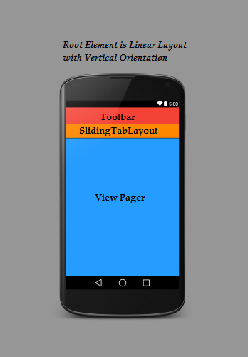
As you can see we have we have made the Linear Layout as the root element for our activity and made the orientation of the LinearLayout as vertical so the elements would be placed one after another, First I have added the toolbar on which I have already made a separate tutorial on how to make a material design toolbar, Next element that I have added is the SlidingTabLayout which acts like a Tab Strip, you can place this strip anywhere in your layout but I want it to be above the pages that are being swiped so I am placing it just below the Toolbar, Next you add the View Pager which is required for swiping the pages. In the code you define every view and then set the SlidingTabs.SetViewPager method to the ViewPager in your activity which is where you tell the app that on page swipe of your View Pager you want the tabs to swipe and change as well.


Steps To Implement Sliding Tab Layout


1. First let's decide the color scheme for our app I want the color scheme to be red so lets do that by making a new color.xml file in your values folder and add the following code to it. You may notice a item in the color.xml with name ScrollColor that is the color which I am going to set to the scroll bar of the Tab Strip.

<?xml version="1.0" encoding="utf-8"?>
<resources>
    <color name="ColorPrimary">#e62117</color>
    <color name="ColorPrimaryDark">#c31c13</color>
    <color name="tabsScrollColor">#8a140e</color>

</resources>


2. Next we need to make a layout file for toolbar and add that layout file to our apps activity_main.xml. So create a new layout file and name it tool_bar.xml and add the following code to it.

<?xml version="1.0" encoding="utf-8"?>
<android.support.v7.widget.Toolbar
    android:layout_height="wrap_content"
    android:layout_width="match_parent"
    android:background="@color/ColorPrimary"
    android:elevation="2dp"
    android:theme="@style/Base.ThemeOverlay.AppCompat.Dark"
    xmlns:android="http://schemas.android.com/apk/res/android" />

3. Now its time to add Toolbar and the SlidingTabLayout to our main_activity.xml, To add SlidingTablayout in your app you must make sure you have already added the SlidingTabLayout.java and SlidingTabStrip.java in your app as explained in the requirements section at the top. If you have added both the files in your project, open your main_activity.xml and add the following code to it. I have given the SlidigTabLayout an id ="Tabs" and added a elevation of 2dp for the shadow effect.

<LinearLayout xmlns:android="http://schemas.android.com/apk/res/android"
    xmlns:tools="http://schemas.android.com/tools"
    android:layout_width="match_parent"
    android:layout_height="match_parent"
    android:orientation="vertical"
    tools:context=".MainActivity">

    <include
        android:id="@+id/tool_bar"
        layout="@layout/tool_bar"
        android:layout_height="wrap_content"
        android:layout_width="match_parent"
        />

    <com.android4devs.slidingtab.SlidingTabLayout
        android:id="@+id/tabs"
        android:layout_width="match_parent"
        android:layout_height="wrap_content"
        android:elevation="2dp"
        android:background="@color/ColorPrimary"/>

</LinearLayout>  

4. Now we just have to add the ViewPager view to your layout, make sure to give it an Id, I have given my ViewPager an Id called pager. Finally your main_activiy.xml looks something like this.

<LinearLayout xmlns:android="http://schemas.android.com/apk/res/android"
    xmlns:tools="http://schemas.android.com/tools"
    android:layout_width="match_parent"
    android:layout_height="match_parent"
    android:orientation="vertical"
    tools:context=".MainActivity">

    <include
        android:id="@+id/tool_bar"
        layout="@layout/tool_bar"
        android:layout_height="wrap_content"
        android:layout_width="match_parent"
        />

    <com.android4devs.slidingtab.SlidingTabLayout
        android:id="@+id/tabs"
        android:layout_width="match_parent"
        android:layout_height="wrap_content"
        android:elevation="2dp"
        android:background="@color/ColorPrimary"/>

    <android.support.v4.view.ViewPager
        android:id="@+id/pager"

        android:layout_height="match_parent"
        android:layout_width="match_parent"
        android:layout_weight="1"
        ></android.support.v4.view.ViewPager>


</LinearLayout>

5. Now I have decided to make 2 tabs for this project, so I have to make the layout for this tabs, so I have created two new layouts tab_1.xml and tab_2.xml and added the medium text view inside both the layout as shown below.

tab_1.xml


<?xml version="1.0" encoding="utf-8"?>
<RelativeLayout xmlns:android="http://schemas.android.com/apk/res/android"
    android:layout_width="match_parent"
    android:layout_height="match_parent">


    <TextView
        android:layout_width="wrap_content"
        android:layout_height="wrap_content"
        android:textAppearance="?android:attr/textAppearanceMedium"
        android:text="You Are In Tab 1"
        android:id="@+id/textView"
        android:layout_centerVertical="true"
        android:layout_centerHorizontal="true" />

</RelativeLayout>

tab_2.xml
<?xml version="1.0" encoding="utf-8"?>
<RelativeLayout xmlns:android="http://schemas.android.com/apk/res/android"
    android:layout_width="match_parent"
    android:layout_height="match_parent">


    <TextView
        android:layout_width="wrap_content"
        android:layout_height="wrap_content"
        android:textAppearance="?android:attr/textAppearanceMedium"
        android:text="You Are In Tab 2"
        android:id="@+id/textView"
        android:layout_centerVertical="true"
        android:layout_centerHorizontal="true" />

</RelativeLayout>

Now I am done with my layout section and its time to work things out in the code.

6. Now let's first make the 2 fragments for Tab1 and Tab2, So go ahead and create two new java files, name it Tab1 and Tab2 and add the following code to it.

Tab1


package com.android4devs.slidingtab;

import android.os.Bundle;
import android.support.annotation.Nullable;
import android.support.v4.app.Fragment;
import android.view.LayoutInflater;
import android.view.View;
import android.view.ViewGroup;

/**
 * Created by hp1 on 21-01-2015.
 */
public class Tab1 extends Fragment {

    @Override
    public View onCreateView(LayoutInflater inflater, @Nullable ViewGroup container, @Nullable Bundle savedInstanceState) {
        View v =inflater.inflate(R.layout.tab_1,container,false);
        return v;
    }
}


Tab2


package com.android4devs.slidingtab;

import android.os.Bundle;
import android.support.annotation.Nullable;
import android.support.v4.app.Fragment;
import android.view.LayoutInflater;
import android.view.View;
import android.view.ViewGroup;

/**
 * Created by hp1 on 21-01-2015.
 */
public class Tab2 extends Fragment {
    @Override
    public View onCreateView(LayoutInflater inflater, @Nullable ViewGroup container, @Nullable Bundle savedInstanceState) {
        View v = inflater.inflate(R.layout.tab_2,container,false);
        return v;
    }
}


7. Now before we start working with MainActiviy we need a ViewPager adapter to provide the views for every page i.e every Tab. So go ahead and make a new java file, name it ViewPagerAdapter and add the following code to it. I have added the comments to help you understand the working.

package com.android4devs.slidingtab;

import android.support.v4.app.Fragment;
import android.support.v4.app.FragmentManager;
import android.support.v4.app.FragmentStatePagerAdapter;

/**
 * Created by hp1 on 21-01-2015.
 */
public class ViewPagerAdapter extends FragmentStatePagerAdapter {

    CharSequence Titles[]; // This will Store the Titles of the Tabs which are Going to be passed when ViewPagerAdapter is created
    int NumbOfTabs; // Store the number of tabs, this will also be passed when the ViewPagerAdapter is created


    // Build a Constructor and assign the passed Values to appropriate values in the class
    public ViewPagerAdapter(FragmentManager fm,CharSequence mTitles[], int mNumbOfTabsumb) {
        super(fm);

        this.Titles = mTitles;
        this.NumbOfTabs = mNumbOfTabsumb;

    }

    //This method return the fragment for the every position in the View Pager
    @Override
    public Fragment getItem(int position) {

        if(position == 0) // if the position is 0 we are returning the First tab
        {
            Tab1 tab1 = new Tab1();
            return tab1;
        }
        else             // As we are having 2 tabs if the position is now 0 it must be 1 so we are returning second tab
        {
            Tab2 tab2 = new Tab2();
            return tab2;
        }


    }

    // This method return the titles for the Tabs in the Tab Strip

    @Override
    public CharSequence getPageTitle(int position) {
        return Titles[position];
    }

    // This method return the Number of tabs for the tabs Strip

    @Override
    public int getCount() {
        return NumbOfTabs;
    }
}


8. Now we have everything ready to start work with the MainActivity.java, So go ahead and add the following code to your MainActivity.java. check out the comments in the code to understand the working.

package com.android4devs.slidingtab;

import android.support.v4.view.ViewPager;
import android.support.v7.app.ActionBarActivity;
import android.os.Bundle;
import android.support.v7.widget.Toolbar;
import android.view.Menu;
import android.view.MenuItem;


public class MainActivity extends ActionBarActivity {

    // Declaring Your View and Variables

    Toolbar toolbar;
    ViewPager pager;
    ViewPagerAdapter adapter;
    SlidingTabLayout tabs;
    CharSequence Titles[]={"Home","Events"};
    int Numboftabs =2;

    @Override
    protected void onCreate(Bundle savedInstanceState) {
        super.onCreate(savedInstanceState);
        setContentView(R.layout.activity_main);


        // Creating The Toolbar and setting it as the Toolbar for the activity

        toolbar = (Toolbar) findViewById(R.id.tool_bar);
        setSupportActionBar(toolbar);


        // Creating The ViewPagerAdapter and Passing Fragment Manager, Titles fot the Tabs and Number Of Tabs.
        adapter =  new ViewPagerAdapter(getSupportFragmentManager(),Titles,Numboftabs);

        // Assigning ViewPager View and setting the adapter
        pager = (ViewPager) findViewById(R.id.pager);
        pager.setAdapter(adapter);

        // Assiging the Sliding Tab Layout View
        tabs = (SlidingTabLayout) findViewById(R.id.tabs);
        tabs.setDistributeEvenly(true); // To make the Tabs Fixed set this true, This makes the tabs Space Evenly in Available width

        // Setting Custom Color for the Scroll bar indicator of the Tab View
        tabs.setCustomTabColorizer(new SlidingTabLayout.TabColorizer() {
            @Override
            public int getIndicatorColor(int position) {
                return getResources().getColor(R.color.tabsScrollColor);
            }
        });

        // Setting the ViewPager For the SlidingTabsLayout
        tabs.setViewPager(pager);


    }


    @Override
    public boolean onCreateOptionsMenu(Menu menu) {
        // Inflate the menu; this adds items to the action bar if it is present.
        getMenuInflater().inflate(R.menu.menu_main, menu);
        return true;
    }

    @Override
    public boolean onOptionsItemSelected(MenuItem item) {
        // Handle action bar item clicks here. The action bar will
        // automatically handle clicks on the Home/Up button, so long
        // as you specify a parent activity in AndroidManifest.xml.
        int id = item.getItemId();

        //noinspection SimplifiableIfStatement
        if (id == R.id.action_settings) {
            return true;
        }

        return super.onOptionsItemSelected(item);
    }
}


Now everything is set, Lets just run our app and check out how it looks


Its Looks perfect. Tabs are working nicely. But what if you want to customize the text color of your Tabs Title for a specific event i.e on Page selected etc and you surely would like to tell the user about the active tab he is on. For this you have to make a selector.xml in  your res/color/ folder and add the following code to your selector.xml, of course change the colors as your requirements

<?xml version="1.0" encoding="utf-8"?>
<selector xmlns:android="http://schemas.android.com/apk/res/android">
    <item android:state_selected="true" android:color="@android:color/white" />
    <item android:state_focused="true" android:color="@android:color/white" />
    <item android:state_pressed="true" android:color="@android:color/white" />
    <item android:color="#8a140e" />
</selector> 

After making the selector you have to add it in your SlidingTabLayout.java, Look for a method called  private void populateTabStrip() and add the following line of code at the end of it.

tabTitleView.setTextColor(getResources().getColorStateList(R.color.selector));
tabTitleView.setTextSize(14);


Look at the SlidingTabLayout code below, I have just copy pasted populateTabStrip() method in which you are suppose to do the changes

private void populateTabStrip() {
        final PagerAdapter adapter = mViewPager.getAdapter();
        final View.OnClickListener tabClickListener = new TabClickListener();

        for (int i = 0; i < adapter.getCount(); i++) {
            View tabView = null;
            TextView tabTitleView = null;

            if (mTabViewLayoutId != 0) {
                // If there is a custom tab view layout id set, try and inflate it
                tabView = LayoutInflater.from(getContext()).inflate(mTabViewLayoutId, mTabStrip,
                        false);
                tabTitleView = (TextView) tabView.findViewById(mTabViewTextViewId);
            }

            if (tabView == null) {
                tabView = createDefaultTabView(getContext());
            }

            if (tabTitleView == null && TextView.class.isInstance(tabView)) {
                tabTitleView = (TextView) tabView;
            }

            if (mDistributeEvenly) {
                LinearLayout.LayoutParams lp = (LinearLayout.LayoutParams) tabView.getLayoutParams();
                lp.width = 0;
                lp.weight = 1;
            }

            tabTitleView.setText(adapter.getPageTitle(i));
            tabView.setOnClickListener(tabClickListener);
            String desc = mContentDescriptions.get(i, null);
            if (desc != null) {
                tabView.setContentDescription(desc);
            }

            mTabStrip.addView(tabView);
            if (i == mViewPager.getCurrentItem()) {
                tabView.setSelected(true);
            }
            tabTitleView.setTextColor(getResources().getColorStateList(R.color.selector));
            tabTitleView.setTextSize(14);
        }
    }


Finally, Everything is set and we are done. Let's just run the app and check out how things work.


Well that's just looks amazing, So with this you have learned how to make Sliding Tabs in Material Design style, If you like this tutorial please subscribe to the blog for coming updates.

Recycler View : Handling OnItemTouch For a Navigation Drawer

In my previous post I had shown you how to make material design navigation drawer with a header view, after that post some of the visitors requested me for a tutorial on how to handle the OnItemTouch or OnClick events for Recycler View for the navigation drawer and so in this post I am going to show you how to do just that. Before we start let me just announce that I have started the Email Subscription for this blog and if you would like to stay updated with the posts here then please subscribe. Thank you in advance.


As this post is an extension to my previous post How To Make Material Design Navigation Drawer, please make sure you read that firstBefore RecyclerView we had ListView which provided a very quick method to add onItemClick but things have changed and now we have to work around a little to make the RecyclerView add an OnItemClick Listener.

How To Handle Clicks For Items In Recycler View


There are two methods to handle the clicks for items in RecyclerView

1. Handle the clicks in the Adapter Class.

2. Handle Clicks in MainActivity Class.

Handling clicks in MainActivity is something that you would like to do most of the time, but if you want just a simple task to be triggered when a item is clicked then you could use the Adapter class to handle clicks. Now handling clicks in Adapter is pretty straight and easy and so first let's learn how to do that

Handling Clicks in Adapter Class

If you have been following the previous article you must know what we have done in our adapter, we have basically assigned all the passed values from the MainActiviy, Created a ViewHolder class and populated the list with the passed resources

To handle clicks we are going to use the ViewHolder class and make it implement OnClickListener, after that we need to override the onClick method and define what should happen when the click event has occurred. Finally, we are going to set the itemView.setOnClickListener(this). itemView here is the view passed to us by the onCreateViewHolder() method after the inflation of the xml file for the single row.

what we have done here is we have said that ViewHolder class is going to to be responsible for handling clicks by making it implement OnClickListner. Now in onClick method you would certainly need to know which item is being clicked i.e what is the position of the item being clicked. To know that we use the method getPosition()

You would get a better understanding once you look at the code, so here is how the Adapter class looks like after implementing the above method.
package com.android4devs.navigationdrawer;

import android.app.Application;
import android.content.Context;
import android.support.v7.widget.RecyclerView;
import android.view.LayoutInflater;
import android.view.View;
import android.view.ViewGroup;
import android.widget.ImageView;
import android.widget.TextView;
import android.widget.Toast;

/**
 * Created by hp1 on 28-12-2014.
 */
public class MyAdapter extends RecyclerView.Adapter<MyAdapter.ViewHolder> {

    private static final int TYPE_HEADER = 0;  // Declaring Variable to Understand which View is being worked on
                                               // IF the viaew under inflation and population is header or Item
    private static final int TYPE_ITEM = 1;

    private String mNavTitles[]; // String Array to store the passed titles Value from MainActivity.java
    private int mIcons[];       // Int Array to store the passed icons resource value from MainActivity.java

    private String name;        //String Resource for header View Name
    private int profile;        //int Resource for header view profile picture
    private String email;       //String Resource for header view email
    Context context;


    // Creating a ViewHolder which extends the RecyclerView View Holder
    // ViewHolder are used to to store the inflated views in order to recycle them

    public static class ViewHolder extends RecyclerView.ViewHolder implements View.OnClickListener {
        int Holderid;

        TextView textView;
        ImageView imageView;
        ImageView profile;
        TextView Name;
        TextView email;
        Context contxt;


        public ViewHolder(View itemView,int ViewType,Context c) {                 // Creating ViewHolder Constructor with View and viewType As a parameter
            super(itemView);
             contxt = c;
            itemView.setClickable(true);
            itemView.setOnClickListener(this);
            // Here we set the appropriate view in accordance with the the view type as passed when the holder object is created

            if(ViewType == TYPE_ITEM) {
                textView = (TextView) itemView.findViewById(R.id.rowText); // Creating TextView object with the id of textView from item_row.xml
                imageView = (ImageView) itemView.findViewById(R.id.rowIcon);// Creating ImageView object with the id of ImageView from item_row.xml
                Holderid = 1;                                               // setting holder id as 1 as the object being populated are of type item row
            }
            else{


                Name = (TextView) itemView.findViewById(R.id.name);         // Creating Text View object from header.xml for name
                email = (TextView) itemView.findViewById(R.id.email);       // Creating Text View object from header.xml for email
                profile = (ImageView) itemView.findViewById(R.id.circleView);// Creating Image view object from header.xml for profile pic
                Holderid = 0;                                                // Setting holder id = 0 as the object being populated are of type header view
            }


        }


        @Override
        public void onClick(View v) {

            Toast.makeText(contxt,"The Item Clicked is: "+getPosition(),Toast.LENGTH_SHORT).show();

        }
    }


    MyAdapter(String Titles[],int Icons[],String Name,String Email, int Profile,Context passedContext){ // MyAdapter Constructor with titles and icons parameter
                                            // titles, icons, name, email, profile pic are passed from the main activity as we
        mNavTitles = Titles;                //have seen earlier
        mIcons = Icons;
        name = Name;
        email = Email;
        profile = Profile;                     //here we assign those passed values to the values we declared here
        this.context = passedContext;

        //in adapter


    }


    //Below first we ovverride the method onCreateViewHolder which is called when the ViewHolder is
    //Created, In this method we inflate the item_row.xml layout if the viewType is Type_ITEM or else we inflate header.xml
    // if the viewType is TYPE_HEADER
    // and pass it to the view holder

    @Override
    public MyAdapter.ViewHolder onCreateViewHolder(ViewGroup parent, int viewType) {

        if (viewType == TYPE_ITEM) {
            View v = LayoutInflater.from(parent.getContext()).inflate(R.layout.item_row,parent,false); //Inflating the layout

            ViewHolder vhItem = new ViewHolder(v,viewType,context); //Creating ViewHolder and passing the object of type view

            return vhItem; // Returning the created object

            //inflate your layout and pass it to view holder

        } else if (viewType == TYPE_HEADER) {

            View v = LayoutInflater.from(parent.getContext()).inflate(R.layout.header,parent,false); //Inflating the layout

            ViewHolder vhHeader = new ViewHolder(v,viewType,context); //Creating ViewHolder and passing the object of type view

            return vhHeader; //returning the object created


        }
        return null;

    }

    //Next we override a method which is called when the item in a row is needed to be displayed, here the int position
    // Tells us item at which position is being constructed to be displayed and the holder id of the holder object tell us
    // which view type is being created 1 for item row
    @Override
    public void onBindViewHolder(MyAdapter.ViewHolder holder, int position) {
        if(holder.Holderid ==1) {                              // as the list view is going to be called after the header view so we decrement the
                                                              // position by 1 and pass it to the holder while setting the text and image
            holder.textView.setText(mNavTitles[position - 1]); // Setting the Text with the array of our Titles
            holder.imageView.setImageResource(mIcons[position -1]);// Settimg the image with array of our icons
        }
        else{

            holder.profile.setImageResource(profile);           // Similarly we set the resources for header view
            holder.Name.setText(name);
            holder.email.setText(email);
        }
    }

    // This method returns the number of items present in the list
    @Override
    public int getItemCount() {
        return mNavTitles.length+1; // the number of items in the list will be +1 the titles including the header view.
    }


    // Witht the following method we check what type of view is being passed
    @Override
    public int getItemViewType(int position) {
        if (isPositionHeader(position))
            return TYPE_HEADER;

        return TYPE_ITEM;
    }

    private boolean isPositionHeader(int position) {
        return position == 0;
    }

}

Now it's time to run the app and check whether the things are working the way we want it to be, so this is what you get once the app is up and running.


Perfect the app is handling the onClick events, so this covers the method of handling onClick for RecyclerView with Adapter class.

Handling Clicks in MainActiviy Class

Handling clicks in MainActivity with List View was pretty easy as List View had a method OnItemClickListener() to handle the clicks, But Recycler View doesn't provide such method, instead it provides an addOnItemTouchListener() This method takes ItemTouchListener Object as parameter and assigns that ItemTouchListner to the Recycler View. Now to understand how the things are needed to be handled in ItemTouchListner you need to understand the Touch FrameWork of Android which is out of the scope of this article but I will try to explain most of the part to help you understand how we handle clicks.

Here is an outline of the method we are using to handle the clicks

1. First we create a GestureDetector object to detect SingleTapUp touch this object can be later called to verify if the touch event is a SingleTapUp type of touch or some other type of touch (swipe touch, long touch). Look at the code below to understand how to create a GestureDetector object.

final GestureDetector mGestureDetector = new GestureDetector(MainActivity.this, new GestureDetector.SimpleOnGestureListener() {

            @Override public boolean onSingleTapUp(MotionEvent e) {
                return true;
            }

        });


GestureDetector object takes two parameters first one is the Context and second one is the GestureListner. we have created a SimpleOnGestureListener() which returns true if the MotionEvent i.e. The touch even is SingleTapUp type of touch. So now if we call mGestureDetector.onTouchEvent(motionEvent) and if it returns true the the MotionEvent passed to it is of type SingleTapUp.

2. The next step is to set addOnItemTouchListener() of the Recycler View by passing the ItemTouchListener object to the this method, This is how the code looks.

mRecyclerView.addOnItemTouchListener(new RecyclerView.OnItemTouchListener() {
            @Override
            public boolean onInterceptTouchEvent(RecyclerView recyclerView, MotionEvent motionEvent) {
                View child = recyclerView.findChildViewUnder(motionEvent.getX(),motionEvent.getY());


                if(child!=null && mGestureDetector.onTouchEvent(motionEvent)){
                    Drawer.closeDrawers();
                   
                    return true;

                }
               

                return false;
            }

            @Override
            public void onTouchEvent(RecyclerView recyclerView, MotionEvent motionEvent) {
                
            }
        });


when you create a new OnItemTouchListner, you have to Override two methods which are 
1. public boolean onInterceptTouchEvent(RecyclerView recyclerView, MotionEvent motionEvent){}

2. public void onTouchEvent(RecyclerView recyclerView, MotionEvent motionEvent){}

Now Recycler View can have touch event in two cases, once when the user is trying to swipe the list up or down and second when the user is clicking on the item in the Recycler View, we don't want recycler view to think that the touch event which has occurred for click, is for swiping and to help us tell this to recycler view we can use the onInterceptTouchEvent, onInterceptTouchEvent takes over the touch event before it is passed to recycler view this way we can check with GestureDetector if the Touch is SingleTapUp type of touch and if it is we can handle the touch and return true and if it's not then we simply return false and let  recycler view handle the touch.

Now we know what structure we need to handle the touch events, there is just one more thing we to handle the touch events and that isthe position of the item being clicked in the list, luckly its very easy to obtain the position, to do that we can use the method from recyclerView.getChildPosition(item)
but as you see we need to pass the item view for which we want the position. So we need to get the view which is being touched or clicked, to get that we use 
recyclerView.findChildViewUnder(motionEvent.getX(),motionEvent.getY()) 
here motionEvent is touchEvent and getX() and getY() provides the location of the touch, findChildViewUnder takes that cordinate location and returns the view under that cordinate, Now we just pass the view returned by this method to .getChildPosition() to get the position of the item being clicked

This explains the exact method, now check out the code for final implementation

package com.android4devs.navigationdrawer;

import android.content.Context;
import android.support.v4.widget.DrawerLayout;
import android.support.v7.app.ActionBarActivity;
import android.os.Bundle;
import android.support.v7.app.ActionBarDrawerToggle;
import android.support.v7.widget.LinearLayoutManager;
import android.support.v7.widget.RecyclerView;
import android.support.v7.widget.Toolbar;
import android.util.Log;
import android.view.GestureDetector;
import android.view.Menu;
import android.view.MenuItem;
import android.view.MotionEvent;
import android.view.View;
import android.widget.Toast;


public class MainActivity extends ActionBarActivity {

    //First We Declare Titles And Icons For Our Navigation Drawer List View
    //This Icons And Titles Are holded in an Array as you can see

    String TITLES[] = {"Home","Events","Mail","Shop","Travel"};
    int ICONS[] = {R.drawable.ic_home,R.drawable.ic_events,R.drawable.ic_mail,R.drawable.ic_shop,R.drawable.ic_travel};

    //Similarly we Create a String Resource for the name and email in the header view
    //And we also create a int resource for profile picture in the header view

    String NAME = "Akash Bangad";
    String EMAIL = "akash.bangad@android4devs.com";
    int PROFILE = R.drawable.aka;

    private Toolbar toolbar;                              // Declaring the Toolbar Object

    RecyclerView mRecyclerView;                           // Declaring RecyclerView
    RecyclerView.Adapter mAdapter;                        // Declaring Adapter For Recycler View
    RecyclerView.LayoutManager mLayoutManager;            // Declaring Layout Manager as a linear layout manager
    DrawerLayout Drawer;                                  // Declaring DrawerLayout

    ActionBarDrawerToggle mDrawerToggle;                  // Declaring Action Bar Drawer Toggle


    @Override
    protected void onCreate(Bundle savedInstanceState) {
        super.onCreate(savedInstanceState);
        setContentView(R.layout.activity_main);

    /* Assinging the toolbar object ot the view
    and setting the the Action bar to our toolbar
     */
    toolbar = (Toolbar) findViewById(R.id.tool_bar);
    setSupportActionBar(toolbar);


        mRecyclerView = (RecyclerView) findViewById(R.id.RecyclerView); // Assigning the RecyclerView Object to the xml View

        mRecyclerView.setHasFixedSize(true);                            // Letting the system know that the list objects are of fixed size

        mAdapter = new MyAdapter(TITLES,ICONS,NAME,EMAIL,PROFILE,this);       // Creating the Adapter of MyAdapter class(which we are going to see in a bit)
                                                                         // And passing the titles,icons,header view name, header view email,
                                                                         // and header view profile picture

        mRecyclerView.setAdapter(mAdapter);                              // Setting the adapter to RecyclerView

       final GestureDetector mGestureDetector = new GestureDetector(MainActivity.this, new GestureDetector.SimpleOnGestureListener() {

            @Override public boolean onSingleTapUp(MotionEvent e) {
                return true;
            }

        });


        mRecyclerView.addOnItemTouchListener(new RecyclerView.OnItemTouchListener() {
            @Override
            public boolean onInterceptTouchEvent(RecyclerView recyclerView, MotionEvent motionEvent) {
                View child = recyclerView.findChildViewUnder(motionEvent.getX(),motionEvent.getY());


                if(child!=null && mGestureDetector.onTouchEvent(motionEvent)){
                    Drawer.closeDrawers();
                   Toast.makeText(MainActivity.this,"The Item Clicked is: "+recyclerView.getChildPosition(child),Toast.LENGTH_SHORT).show();

                    return true;

                }

                return false;
            }

            @Override
            public void onTouchEvent(RecyclerView recyclerView, MotionEvent motionEvent) {

            }
        });


        mLayoutManager = new LinearLayoutManager(this);                 // Creating a layout Manager

        mRecyclerView.setLayoutManager(mLayoutManager);                 // Setting the layout Manager


        Drawer = (DrawerLayout) findViewById(R.id.DrawerLayout);        // Drawer object Assigned to the view
        mDrawerToggle = new ActionBarDrawerToggle(this,Drawer,toolbar,R.string.openDrawer,R.string.closeDrawer){

            @Override
            public void onDrawerOpened(View drawerView) {
                super.onDrawerOpened(drawerView);
                // code here will execute once the drawer is opened( As I dont want anything happened whe drawer is
                // open I am not going to put anything here)
            }

            @Override
            public void onDrawerClosed(View drawerView) {
                super.onDrawerClosed(drawerView);
                // Code here will execute once drawer is closed
            }


    }; // Drawer Toggle Object Made
        Drawer.setDrawerListener(mDrawerToggle); // Drawer Listener set to the Drawer toggle
        mDrawerToggle.syncState();               // Finally we set the drawer toggle sync State

    }


    @Override
    public boolean onCreateOptionsMenu(Menu menu) {
        // Inflate the menu; this adds items to the action bar if it is present.
        getMenuInflater().inflate(R.menu.menu_main, menu);
        return true;
    }

    @Override
    public boolean onOptionsItemSelected(MenuItem item) {
        // Handle action bar item clicks here. The action bar will
        // automatically handle clicks on the Home/Up button, so long
        // as you specify a parent activity in AndroidManifest.xml.
        int id = item.getItemId();

        //noinspection SimplifiableIfStatement
        if (id == R.id.action_settings) {
            return true;
        }

        return super.onOptionsItemSelected(item);
    }
}


With the code done, its time to run the app and check how the things are working


So finally our drawer is up and running and the rows are now clickable, with this we are done with implementing click events for navigation drawer. Again if you liked this post and would like to stay updated for the upcoming posts please make sure you subscribe to the mail list, also let me know if you liked the post through the comments below.

How To Make Material Design Navigation Drawer With Header View

One of the most evident changes when the material design came out and I got my hands on was the new Navigation Drawer, The Hamburger toggle icon animation seemed very beautiful, The Overlapping drawer on status bar also seemed nice effect and so we are going to learn how to make a Navigation Drawer in this tutorial, with that effect and we are going to use the new RecyclerView for making the list view with the header (just like Gmail app's Navigation Drawer) in the sliding drawer, So let's begin.


Prerequisites

We are going to make the 
Navigation Drawer over the Action Bar/ App Bar we made in the previous post. It isn't completely necessary to read the previous post where I show how to make a material design App Bar but I strongly recommend you to read it once.

Requirements

1. Android Studio 1.0.1 (Latest at the time of writing this post)


2. CircleImage Library (which is used in the header view for the profile picture). Add this library in your gradel build by including the following dependency

compile 'de.hdodenhof:circleimageview:1.2.1'


3. Appcombat v7-21 Support Library As I have explained in my earlier post, If you are running over new Android studio you don't need to add a compiled dependency of appcombat v7 21 as the Android Studio takes care of it. The next thing you need to add in your gradel build is compiled dependency for RecyclerView. To do that add the following line in your build.gradel file.

compile 'com.android.support:recyclerview-v7:21.0.+' 


Let's Understand How the Navigation Drawer Works


To make a Navigation Drawer, you have to initiate it in the XML file of the activity on which you want to implement the material design sliding drawer. To initiate the Navigation Drawer we need to use the XML tag as shown below and as with any other view you have to set the layout attributes such as Height, Width, and Id etc. Drawer Layout should have two child views

First Child - Main Content
Second Child - Sliding Drawer Content

For Example look at the structure below
<android.support.v4.widget.DrawerLayout>

<RelativeLayout></RelativeLayout> - Main Content (First Child)
 <RecyclerView></RecyclerView> - Sliding Drawer Content (Second Child)

</android.support.v4.widget.DrawerLayout>

Now you have to decide from which side of the app you want your Navigation Drawer to slid in the layout, Depending on your choice set the layout_gravityt of the child view to either left if you want the drawer to slide from left or right if you want it to slide from right.

Steps To Make A Material Design Navigation Drawer 

First let's see what we are trying to make


As you can see we have a sliding drawer which slides from the left side of the app and overlaps the translucent status bar, inside the drawer we have a header view which contains a circular view for the profile picture and two Text Views, below that there is our List view with icons.

As we are making a navigation drawer over the Action Bar/App Bar we made in the earlier post what we have with us while we start out, looks something like this

app bar

Just a App Bar with icons on it as we made this in my previous post

Now lets start to code our Navigation Drawer


1. First open up our activity_main.xml file from res folder and add a DrawerLayout as the root view of the app and inside the drawer layout add the App bar which is done by adding the include tag inside the first child of your drawer layout (in my case its the linear layout) now as the drawer layout is your root layout and you have included the App bar inside the drawers first child, all this makes sure the drawer slides over the App bar as we wanted. You would get the clear understanding after you see the layout file.  

This is how the activity_main.xml looks like


<?xml version="1.0" encoding="utf-8"?>

<android.support.v4.widget.DrawerLayout 

    xmlns:android="http://schemas.android.com/apk/res/android"
    android:id="@+id/DrawerLayout"
    android:layout_width="match_parent"
    android:layout_height="match_parent"
    android:elevation="7dp">


    <LinearLayout
        android:layout_width="match_parent"
        android:layout_height="match_parent"
        android:orientation="vertical">


        <include
            android:id="@+id/tool_bar"
            layout="@layout/tool_bar">
        </include>

        <TextView
            android:layout_width="wrap_content"
            android:layout_height="wrap_content"
            android:text="Hello World" />

    </LinearLayout>


    <android.support.v7.widget.RecyclerView
        android:id="@+id/RecyclerView"
        android:layout_width="320dp"
        android:layout_height="match_parent"
        android:layout_gravity="left"

        android:background="#ffffff"
        android:scrollbars="vertical">

    </android.support.v7.widget.RecyclerView>


</android.support.v4.widget.DrawerLayout>


2. Now let's define how a single row in the navigation drawer list going to look like, For that make a new layout file by going to res=>layouts and make a new layout file and name it item_row.xml. Now as we want to have a icon and a title in in every row of our list we would put an image view and TextView inside a RelativeLayout.

Here is how the item_row.xml looks like


<?xml version="1.0" encoding="utf-8"?>
<LinearLayout xmlns:android="http://schemas.android.com/apk/res/android"
    android:layout_width="wrap_content"
    android:paddingTop="8dp"
    android:paddingBottom="8dp"
    android:layout_height="wrap_content"
    android:background="#ffffff"
    android:orientation="horizontal">


    <ImageView
        android:layout_width="wrap_content"
        android:layout_height="wrap_content"
        android:id="@+id/rowIcon"
        android:paddingLeft="16dp"
        android:src="@drawable/ic_launcher"/>

    <TextView
        android:layout_width="wrap_content"
        android:layout_height="wrap_content"
        android:paddingLeft="12dp"
        android:paddingTop="4dp"
        android:textAppearance="?android:attr/textAppearanceMedium"
        android:text="Medium Text"
        android:id="@+id/rowText" />

</LinearLayout>


3. Now we need to define our Header View and for that we make a new layout file by going to  res=>layouts and create a new layout file, name the new layout file as header.xml. Now our header view has one circular image view for profile picture and two text views, adding text view is easy and to add circular profile picture I have used a library called CircleImageView as i have told earlier, and finally to make things look good I have given a background image to the header view. for better understanding look at the layout file

This is how the header.xml looks like.
<?xml version="1.0" encoding="utf-8"?>
<RelativeLayout xmlns:android="http://schemas.android.com/apk/res/android"
    android:layout_width="match_parent"
    android:layout_height="178dp"
    android:background="@drawable/background_poly"
    android:orientation="vertical"
    android:weightSum="1">


    <LinearLayout
        android:layout_width="match_parent"
        android:layout_height="56dp"
        android:orientation="vertical"
        android:layout_alignParentBottom="true"
        android:layout_alignParentLeft="true"
        android:layout_alignParentStart="true">

        <TextView
            android:id="@+id/name"
            android:layout_width="wrap_content"
            android:layout_height="wrap_content"
            android:layout_marginLeft="16dp"
            android:textColor="#ffffff"
            android:text="Akash Bangad"
            android:textSize="14sp"
            android:textStyle="bold"

            />

        <TextView
            android:id="@+id/email"
            android:layout_width="wrap_content"
            android:layout_height="wrap_content"
            android:textColor="#ffffff"
            android:layout_marginLeft="16dp"
            android:layout_marginTop="5dp"
            android:text="akash.bangad93@gmail.com"
            android:textSize="14sp"
            android:textStyle="normal"

            />
    </LinearLayout>

    <de.hdodenhof.circleimageview.CircleImageView
        android:layout_width="70dp"
        android:layout_height="70dp"
        android:src="@drawable/aka"
        android:layout_marginLeft="16dp"
        android:layout_marginTop="38dp"
        android:id="@+id/circleView"
       />
</RelativeLayout>

4. The next step is to put icons and images in our projects Drawables folder, As always i have downloaded icons from www.icons4android.com which is one of the 5 tools I recommend everyone to use, Copied those icons and pasted them in drawable folder inside my project. I have also added two pictures to the project one is for the header background and other is for the profile picture.

5. Now we have all the layouts ready, We have to initiate everything in code now. So let's look at MainActivity.java I have put up the comments to help you understand what's going on 


package com.android4devs.navigationdrawer;

import android.support.v4.widget.DrawerLayout;
import android.support.v7.app.ActionBarActivity;
import android.os.Bundle;
import android.support.v7.app.ActionBarDrawerToggle;
import android.support.v7.widget.LinearLayoutManager;
import android.support.v7.widget.RecyclerView;
import android.support.v7.widget.Toolbar;
import android.view.Menu;
import android.view.MenuItem;
import android.view.View;


public class MainActivity extends ActionBarActivity {

    //First We Declare Titles And Icons For Our Navigation Drawer List View
    //This Icons And Titles Are holded in an Array as you can see

    String TITLES[] = {"Home","Events","Mail","Shop","Travel"};
    int ICONS[] = {R.drawable.ic_home,R.drawable.ic_events,R.drawable.ic_mail,R.drawable.ic_shop,R.drawable.ic_travel};

    //Similarly we Create a String Resource for the name and email in the header view
    //And we also create a int resource for profile picture in the header view

    String NAME = "Akash Bangad";
    String EMAIL = "akash.bangad@android4devs.com";
    int PROFILE = R.drawable.aka;

    private Toolbar toolbar;                              // Declaring the Toolbar Object

    RecyclerView mRecyclerView;                           // Declaring RecyclerView
    RecyclerView.Adapter mAdapter;                        // Declaring Adapter For Recycler View
    RecyclerView.LayoutManager mLayoutManager;            // Declaring Layout Manager as a linear layout manager
    DrawerLayout Drawer;                                  // Declaring DrawerLayout

    ActionBarDrawerToggle mDrawerToggle;                  // Declaring Action Bar Drawer Toggle


    @Override
    protected void onCreate(Bundle savedInstanceState) {
        super.onCreate(savedInstanceState);
        setContentView(R.layout.activity_main);

    /* Assinging the toolbar object ot the view
    and setting the the Action bar to our toolbar
     */
    toolbar = (Toolbar) findViewById(R.id.tool_bar);
    setSupportActionBar(toolbar);


        mRecyclerView = (RecyclerView) findViewById(R.id.RecyclerView); // Assigning the RecyclerView Object to the xml View

        mRecyclerView.setHasFixedSize(true);                            // Letting the system know that the list objects are of fixed size

        mAdapter = new MyAdapter(TITLES,ICONS,NAME,EMAIL,PROFILE);       // Creating the Adapter of MyAdapter class(which we are going to see in a bit)
                                                                         // And passing the titles,icons,header view name, header view email,
                                                                         // and header view profile picture

        mRecyclerView.setAdapter(mAdapter);                              // Setting the adapter to RecyclerView

        mLayoutManager = new LinearLayoutManager(this);                 // Creating a layout Manager

        mRecyclerView.setLayoutManager(mLayoutManager);                 // Setting the layout Manager


        Drawer = (DrawerLayout) findViewById(R.id.DrawerLayout);        // Drawer object Assigned to the view
        mDrawerToggle = new ActionBarDrawerToggle(this,Drawer,toolbar,R.string.openDrawer,R.string.closeDrawer){

            @Override
            public void onDrawerOpened(View drawerView) {
                super.onDrawerOpened(drawerView);
                // code here will execute once the drawer is opened( As I dont want anything happened whe drawer is
                // open I am not going to put anything here)
            }

            @Override
            public void onDrawerClosed(View drawerView) {
                super.onDrawerClosed(drawerView);
                // Code here will execute once drawer is closed
            }


    }; // Drawer Toggle Object Made
        Drawer.setDrawerListener(mDrawerToggle); // Drawer Listener set to the Drawer toggle
        mDrawerToggle.syncState();               // Finally we set the drawer toggle sync State

    }


    @Override
    public boolean onCreateOptionsMenu(Menu menu) {
        // Inflate the menu; this adds items to the action bar if it is present.
        getMenuInflater().inflate(R.menu.menu_main, menu);
        return true;
    }

    @Override
    public boolean onOptionsItemSelected(MenuItem item) {
        // Handle action bar item clicks here. The action bar will
        // automatically handle clicks on the Home/Up button, so long
        // as you specify a parent activity in AndroidManifest.xml.
        int id = item.getItemId();

        //noinspection SimplifiableIfStatement
        if (id == R.id.action_settings) {
            return true;
        }

        return super.onOptionsItemSelected(item);
    }
}


6. Now we have to make the adapter fot the header view and list view in our drawer, earlier adding headers was as easy as calling addHeaderView() function from the object of list view but with recycler view things have changed and now we have to make changes to our adapter to make it understand that we want the first row of the list to be our header, we do that by inflating the header.xml for the first row and item_row.xml for the rest of the rows. look at the code where I have explained the process with appropriate comments.

So this is how the MyAdapter.java looks like

package com.android4devs.navigationdrawer;

import android.support.v7.widget.RecyclerView;
import android.view.LayoutInflater;
import android.view.View;
import android.view.ViewGroup;
import android.widget.ImageView;
import android.widget.TextView;
import android.widget.Toast;

/**
 * Created by hp1 on 28-12-2014.
 */
public class MyAdapter extends RecyclerView.Adapter<MyAdapter.ViewHolder> {
    
    private static final int TYPE_HEADER = 0;  // Declaring Variable to Understand which View is being worked on 
                                               // IF the view under inflation and population is header or Item 
    private static final int TYPE_ITEM = 1;

    private String mNavTitles[]; // String Array to store the passed titles Value from MainActivity.java
    private int mIcons[];       // Int Array to store the passed icons resource value from MainActivity.java
    
    private String name;        //String Resource for header View Name
    private int profile;        //int Resource for header view profile picture
    private String email;       //String Resource for header view email  


    // Creating a ViewHolder which extends the RecyclerView View Holder
    // ViewHolder are used to to store the inflated views in order to recycle them

    public static class ViewHolder extends RecyclerView.ViewHolder {
        int Holderid;       
        
        TextView textView;  
        ImageView imageView;
        ImageView profile;
        TextView Name;
        TextView email;
       

        public ViewHolder(View itemView,int ViewType) {                 // Creating ViewHolder Constructor with View and viewType As a parameter
            super(itemView);
            
           
            // Here we set the appropriate view in accordance with the the view type as passed when the holder object is created
            
            if(ViewType == TYPE_ITEM) {
                textView = (TextView) itemView.findViewById(R.id.rowText); // Creating TextView object with the id of textView from item_row.xml
                imageView = (ImageView) itemView.findViewById(R.id.rowIcon);// Creating ImageView object with the id of ImageView from item_row.xml
                Holderid = 1;                                               // setting holder id as 1 as the object being populated are of type item row
            }
            else{


                Name = (TextView) itemView.findViewById(R.id.name);         // Creating Text View object from header.xml for name 
                email = (TextView) itemView.findViewById(R.id.email);       // Creating Text View object from header.xml for email
                profile = (ImageView) itemView.findViewById(R.id.circleView);// Creating Image view object from header.xml for profile pic
                Holderid = 0;                                                // Setting holder id = 0 as the object being populated are of type header view
            }
        }

        
    }


    MyAdapter(String Titles[],int Icons[],String Name,String Email, int Profile){ // MyAdapter Constructor with titles and icons parameter
                                            // titles, icons, name, email, profile pic are passed from the main activity as we
        mNavTitles = Titles;                //have seen earlier
        mIcons = Icons;
        name = Name;
        email = Email;
        profile = Profile;                     //here we assign those passed values to the values we declared here
        //in adapter


    }


    //Below first we ovverride the method onCreateViewHolder which is called when the ViewHolder is
    //Created, In this method we inflate the item_row.xml layout if the viewType is Type_ITEM or else we inflate header.xml
    // if the viewType is TYPE_HEADER
    // and pass it to the view holder

    @Override
    public MyAdapter.ViewHolder onCreateViewHolder(ViewGroup parent, int viewType) {

        if (viewType == TYPE_ITEM) {
            View v = LayoutInflater.from(parent.getContext()).inflate(R.layout.item_row,parent,false); //Inflating the layout

            ViewHolder vhItem = new ViewHolder(v,viewType); //Creating ViewHolder and passing the object of type view

            return vhItem; // Returning the created object

            //inflate your layout and pass it to view holder

        } else if (viewType == TYPE_HEADER) {

            View v = LayoutInflater.from(parent.getContext()).inflate(R.layout.header,parent,false); //Inflating the layout

            ViewHolder vhHeader = new ViewHolder(v,viewType); //Creating ViewHolder and passing the object of type view

            return vhHeader; //returning the object created

            
        }
        return null;

    }

    //Next we override a method which is called when the item in a row is needed to be displayed, here the int position
    // Tells us item at which position is being constructed to be displayed and the holder id of the holder object tell us 
    // which view type is being created 1 for item row
    @Override
    public void onBindViewHolder(MyAdapter.ViewHolder holder, int position) {
        if(holder.Holderid ==1) {                              // as the list view is going to be called after the header view so we decrement the 
                                                              // position by 1 and pass it to the holder while setting the text and image
            holder.textView.setText(mNavTitles[position - 1]); // Setting the Text with the array of our Titles
            holder.imageView.setImageResource(mIcons[position -1]);// Settimg the image with array of our icons
        }
        else{

            holder.profile.setImageResource(profile);           // Similarly we set the resources for header view
            holder.Name.setText(name);
            holder.email.setText(email);
        }
    }

    // This method returns the number of items present in the list
    @Override
    public int getItemCount() {
        return mNavTitles.length+1; // the number of items in the list will be +1 the titles including the header view.
    }

    
    // Witht the following method we check what type of view is being passed 
    @Override
    public int getItemViewType(int position) {  
        if (isPositionHeader(position))
            return TYPE_HEADER;

        return TYPE_ITEM;
    }

    private boolean isPositionHeader(int position) {
        return position == 0;
    }

}


Now if you run the app this is what you would see


As you can see the drawer is overlapping the Toolbar/ Action bar, If you are happy with this design and pattern then you can consider the project done, as this pattern is also one of the material design patterns used by many official Google apps and other apps as well, now if you want to make the status bar translucent and have your drawer slide under the status bar then you should follow along

Before we get to making the status bar translucent and having our drawer slide below it I must tell you the method you are going to see isnt exactly the right way to implement the above effect as if we want the drawer to slide below the status bar we have to make the status bar translucent and once we make it translucent we can not assign any color to the status bar. You would understand what I am talking about in just a minute

First let me tell you that the status bar translucent method is not available for pre kitkat devices, so we make two styles.xml files one for version 19 api (kitkat) and one for Version 21 api (Lollipop). so in all we have three styles.xml files.

we now add the following styles to both our styles.xml files i.e style for kitkat and lollipop
here is how the style.xml file look for both the files.


<?xml version="1.0" encoding="utf-8"?>
<resources>

    <style name="AppTheme" parent="Theme.AppCompat.Light.NoActionBar" >
        <item name="android:windowTranslucentStatus">true</item>
    </style>

</resources>

Now if you look at the app this is what you are going to see


As you can see we have got the translucent status bar but the toolbar got below it and if you add the android:fitSystemWindows="true"  tag in your activity_main.xml as a property to the root layout( DrawerLayout) file the toolbar will move down and adjust to the status bar but even if we get the toolbar down we won't be able to change the color of the status bar once it is set to translucent. now as i have earlier said this is not the exact method to do this, if you look at the stack overflow discussion here you could find that to achieve the above effect you have to use scrimInsetFrameLayout which i dont belive is really very complicated for this effect

So what I do is I have added a padding of 24dp to the tool_bar.xml and as I only want the padding to take effect on kitkat and lollipop devices I have made two dimens files with version api set to 19 and 21 for kitkat  and lollipop respectevely and for the pre lollipop devices I have set 0dp padding in the 3rd dimens file, then I have added the padding top to tool_bar.xml

so finally this is how tool_bar.xml looks
<?xml version="1.0" encoding="utf-8"?>
<android.support.v7.widget.Toolbar xmlns:android="http://schemas.android.com/apk/res/android"
    android:layout_width="match_parent"
    android:layout_height="wrap_content"
    android:background="@color/ColorPrimary"
    android:theme="@style/ThemeOverlay.AppCompat.Dark"
    android:elevation="4dp"
    android:paddingTop="@dimen/tool_bar_top_padding"


    >

</android.support.v7.widget.Toolbar>


Now everything is done and set and if you open the app this is what you would get


Perfect it looks just the way wanted it to be, So that's how you make a Material design Navigation Drawer which has a Hamburger Toggle icons animating into arrow. If you liked this post please comment and share the post on your social networks.

EDIT: head over to Recycler View : Handling OnItemTouch For Navigation Drawer post if you want to learn how to handle the click events for navigation drawer.