Showing posts with label Tutorial. Show all posts

How To Make Facebook Messenger Chat Bot With Api.ai

Alright, Time has finally came where we have started moving from GUI to Conversational UI (CUI), We are moving into world where we would be conversing with technology as we would do with any other person, for Iron-Man fans, Yeah its right Jarvis is going to be a real thing soon enough and with this ability computing is going to be much easier and as app and smart phone ecosystem came and changed our life so will the conversational UI.

But understanding human speech has its own challenges, what we humans have learned and created over so many years about language and speech can not be tought to computers via some algorithm or formula it needs much more than that. It needs the computer to recognize patterns and create its own understanding and here is where machine learning comes to rescue you can Google more about it if you are interested.

But for us developers we don't need to teach our system the language because giants like Google and Facebook are here to help you out. Google provides service called Api.ai which helps you build conversational user experience.

What We Are Going To Build

We are going to build a Facebook messenger bot which would recommend you movie based on your genre preferences selection

This tutorial would be in two parts

Part 1 - Creating API.ai Agent and connecting it with Facebook Messenger

Part 2 - How to make a node.js backend for Facebook Messenger Chat Bot
(Connecting our bot to www.themoviedb.org api with Node.js backend for movie recommendation)

Getting Started With Api.ai 

Step 1. Sign up to api.ai and log into your account you would be presented with the dash board.

Step 2. Click on create a new agent, consider agents as your project engine which process language and spits out actions you define when language input matches the pattern you want.

Step 3. Name your agent now, I am naming my agent as "MovieBot", add a description and hit save button 


Understanding API.AI Agent

There are two important things that you need to understand about api,ai agents before we move any further, These are the two main components of the service.

1. Intents - Think of intents as actions you want your bot to send to you along with the parameters you want for ex. Our movie bot has only one action and that is to recommend movie, so the intention or the intent can be defined as movie.recommendation  

2. Entities - Entities are concepts that your bot should understand and using this concepts your bot would extract parameter values for your intents, our movie bot is going to recommend movies based on genre you wants so one concept that our bot needs to understand is genre so movie.genre would be one entity for our bot. similarly if we want our bot to recommend movie based on cast we would add movie.cast as one of the entity as well.


Creating Entities

Now as we know about entities lets start with adding one for our movie bot

1. Click on the entities tab on your dashboard
2. Then click on Create Entity button on top right
3. You would be on a page similar to shown in below screen shot.


Step 4. Fill the fields as shown in the above image, First lets name our entity movie-gener then in the space below add a row  and in it add some examples of movie geners as you can see in the screen shot. The left hand side is the parameter value that you want your bot to send to your backend and right hand side are the words or phrases that could map to those parameter value for example when your says "show me some funny movies" I want this to send me movie-gener parameter with the value of comedy, so in the left hand side I have named the parameter value and in right hand side I have mentioned some synonyms or phrases that should be used to map.

Step 5. After you have added your examples click on save, give it some time to save do not close the browser.With that we have the Entities part ready.

Creating Intent 

As we had discussed earlier we know that intents help us map user said phrases to developer defined actions or we can call it developer defined intents.

Step 1. Click on intent on dashboard and then hit create intents
Step 2. Name your intent, our intent is just one and that is movie recommendation, so I have named it movie.recommendation
Step 3. There are three sections to creating intents that are

A. User Says


Here you would add some example phrases that would trigger your movie intent, For movie recommendation a user might say something like "I  would like to watch a movie" which would trigger our Intent we are also going to handle the genre which a user could say something like "I would like to watch a horror movie" so all such phrases we would add in the user says section while you add those you can highlight a single word in a sentence and define which entity it matches if the agent it self doesn't understands the entities in the sentence you can read more on this from the offical documentation.

B. Action


Here you define what action would be triggered for your user says phrases, for us its our intent action it self so we have mentioned the action to be movie.recommendation along with this action we can see the list of parameters that have been extracted from our user says example phrases, from the list we can define if any parameter is absolutely required for our action by ticking the required box. As we need movie genre to be specified for us to provide the movie result we have marked it as required. But what if user says something like "I want to watch a movie" then we can not just leave the user blank as we dont have a gener to show him the movies. In such case bot will send the prompt question that you have set to extract the required parameter from user. So If user says "I want to watch a movie" our bot would reply with "From which gener do you want ?" and extract the required parameter.
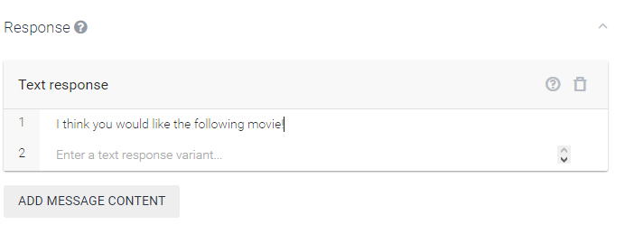
C. Response


And finally when all is perfect and you have your required parameters here is where you define what the response text from the bot would be.

With this we have our conversational engine set up we can test it on Api.ai it self via the "Try it now" console.

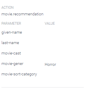
Here is the screen shot of our bot in Try It Now console


As you can see It is working fine, We first hit the agent with the query "I would like to watch a movie" for which we receive the response "From which gener to do you want ?" as agent was not able to find the genre from the query . Then we enter "I think I am in mood of horror movies" and agent gives us the response "I think you would like the following movies"  with intent value of movie.recomendation and movie-gener parameter value set to Horror just as we had wanted.

With this we have our Converstional UI tested and ready to be integrated with Facebook Messanger Platform 


Integrating Api.ai Bot with Facebook Messenger

Now we need to connect the bot with Facebook messenger, For that we need to follow the following steps

Step 1. Log into Facebook Developer Console and create a new app as shown below.


Name your app with your agent name here, add your email id and select apps for messenger as the category then hit create App ID.


Step 2. Now you would be taken to a screen as shown below, you have to select a page for your messenger bot, if you dont have a page created you can create a new page and come back to this page, after selecting the page facebook will generate a Page Access Token for that page


Copy that Page access token and save it somewhere we would need it in the next step

Step 3. Now time to actually connect the page we created with the api,ai agent we made earlier for that go to api.ai dashboard of your agent and select integration as shown in the picture below.


Enable the Facebook Messenger toggle and click on setting.
In the settings panel enter the details as shown in the picture below

 .

Add a verify token which would help verify your bot identity to FB messenger keep it secret and do not share it. Paste the Page Access token that you had generated earlier here in page access token box, now copy the Callback URL which you would need in the next step.

Step 4. Now we need to configure Webhook go to the developer page on Facebook, In the products tabs go to messenger and click on set up webhooks, you would see a screen as shown below, Paste the Callback URL that you copied in last step and also enter the verify token you created previously, tick the messages and messages_postbacks check box and hit verify and save.


Step 5. Now its time to test the first phase of our bot, go to the page you created for your bot and try and send a messenger to the the page, If you have correctly followed the tutorial you would have your bot give you response as below.


So we have successfully created our Facebook bot which can handle basic conversations and extract out the parameters required to fulfill user requirement i.e movie recommendation.

In the next part we would connect this bot to movie API from TheMovieDb and thus provide user a movie recommendation as we had decided.

Here is the next part of this tutorial - How to make a node.js backend for Facebook Messenger Chat Bot


Tab Layout - Material Design Support Library Tutorial (Sliding Tabs)

With Material Design Support library out and available, Building great looking android apps have become easier for a developers. Today we are going to take a look at building Sliding Tabs in android. I have covered the development of sliding tabs before this library was available in another post which was a little tiresome job, with Material design support library integrating sliding tabs in your layout has now become a piece of cake.


Prerequisites

This tutorial is going to use a toolbar as action bar and if you aren't familiar with building toolbar then before starting out this tutorial please go through that my Toolbar tutorial. This is not absolutely necessary but I strongly recommend you do give it a read.

Secondly I have explained the working of sliding tabs in my previous post before this library was out. I recommend you to give that post a read as well, I don't want you to read the complete tutorial but just the part under
"Understanding The Sliding Tab Layout Implementation"

Requirements

1. Android Studio (latest version recommended)

2. Material Design Support Library (Add the dependency mention below)

compile 'com.android.support:design:22.2.0


Let Us Understand Sliding Tabs/ Tab Layout 


Material design support library provides a class called TabLayout which is basically a view class, required to be added into you layout for creating Sliding Tabs. Most of the times you are going to add this view below your toolbar because thats where you want your Tabs to be placed. Before staring out lets have a look at what we are trying to build up in this tutorial.


As you can see the tabs viz. Home, Inbox, Star are hold by Tab Layout which is placed right below the Toolbar, below the tab layout we have a view pager which is going to be linked with tab layout to achieve the desired effect.


Steps To Build Sliding Tabs With Tab Layout


1. Open Android studio and create a new blank project, after your project has been created go to the res->values folder and create a new file named color.xml. Add the following lines to that file, everything about those colors have been explained in my Toolbar tutorial. The property with name "indicator" is used to define the color of the indicator line below the tabs. which we will set appropriately to the indicator while we code.

<?xml version="1.0" encoding="utf-8"?>
<resources>
    <color name="PrimaryColor">#2196F3</color>
    <color name="PrimaryDarkColor">#1976D2</color>
    <color name="indicator">#ecd95a</color>

</resources>

2. Now we need to create a state list selector for the tabs text, this state list selector will define the text color of the tabs when they are selected and also define the default text color (When the tab is not the selected tab) So go to res folder and create a new folder named Color. Now create a new file inside this folder and name it tab_selector.xml and add the following lines to that file.

<?xml version="1.0" encoding="utf-8"?>
<selector xmlns:android="http://schemas.android.com/apk/res/android">
        <item android:state_selected="true" android:color="@android:color/white" />
        <item android:state_focused="true" android:color="@android:color/white" />
        <item android:state_pressed="true" android:color="@android:color/white" />
        <item android:color="#d1c9c9" />
</selector>

Here the lines which define the color of text when either selected, focused or pressed are as following

<item android:state_selected="true" android:color="@android:color/white" />
<item android:state_focused="true" android:color="@android:color/white" />
<item android:state_pressed="true" android:color="@android:color/white" />

And the line below defines the default color for the text on tabs.

<item android:color="#d1c9c9" />

3. Now we need to define the style of our app for this project we are only going to define the color properties of our app, you can also define many other properties like text color, text type and font sizes and many more. To do that go to res->values->style.xml and add the following lines to your file. Again all this has been explained previously in my Toolbar tutorial.
<resources>
    <!-- Base application theme. -->
    <style name="AppTheme" parent="Theme.AppCompat.Light.NoActionBar">
        <item name="colorPrimary">@color/PrimaryColor</item>
        <item name="colorPrimaryDark">@color/PrimaryDarkColor</item>
        <!-- Customize your theme here. -->
    </style>
</resources>

4. Now time to set up out tabs in our layout go to res->layout->activity_main.xml and add the following lines of code in your file. All we are doing here is basically we are having a relative layout as our root view inside which we are adding Toolbar, below Toolbar we have our Tab Layout and below Tab Layout we have ViewPager. We are setting the background color of the tabs to the primary color which is blue. The same color has been setup for toolbar as well.
<RelativeLayout xmlns:android="http://schemas.android.com/apk/res/android"
    xmlns:tools="http://schemas.android.com/tools"
    android:layout_width="match_parent"
    android:background="#dfdfdf"
    android:layout_height="match_parent"
    tools:context=".MainActivity">

    <include
        android:id="@+id/tool_bar"
        layout="@layout/toolbar"/>

    <android.support.design.widget.TabLayout
        android:id="@+id/tabs"
        android:layout_width="match_parent"
        android:layout_height="wrap_content"
        android:background="@color/PrimaryColor"
        android:layout_below="@+id/tool_bar"
        android:layout_alignParentLeft="true"
        android:layout_alignParentStart="true" />

    <android.support.v4.view.ViewPager
        android:id="@+id/viewpager"
        android:layout_width="match_parent"
        android:layout_height="match_parent"
        android:layout_below="@+id/tabs"
        />

</RelativeLayout>


5. Now lets define how a single tabs content will look like, As you have seen we are not going to do anything fancy we are just having a simple text which says "Hello, This is a tab layout" which is placed in middle of the the screen. So go to res->layout and create a new layout name it tabs.xml and add the following lines of code to it.
<?xml version="1.0" encoding="utf-8"?>
<RelativeLayout xmlns:android="http://schemas.android.com/apk/res/android"
    android:layout_width="match_parent"
    android:layout_height="match_parent"
    android:orientation="vertical">

    <TextView
        android:layout_width="wrap_content"
        android:layout_height="wrap_content"
        android:textAppearance="?android:attr/textAppearanceMedium"
        android:text="This is a tab layout"
        android:id="@+id/textView"
        android:layout_centerVertical="true"
        android:layout_centerHorizontal="true" />
</RelativeLayout>

6. Now we are pretty much done with the design part of the app so we can start coding it now. First of all we have added a view pager in the layout so we need to create a fragment which this view pager will hold. We are going to have three tabs but for ease of this tutorial I am only going to create one fragment which this view pager will hold and the same fragment will be shown when the tab changes. obviously you can create new fragment and add different content in them as per your requirement. We have already created the layout for the fragment (tabs.xml) now we need to code it so go to java->[package name] and create a new java class and name it TabFragment.java and add the following lines of code to that file.

package com.android4devs.slidingtabs;

import android.os.Bundle;
import android.support.v4.app.Fragment;
import android.view.LayoutInflater;
import android.view.View;
import android.view.ViewGroup;

/**
 * Created by Admin on 11-12-2015.
 */
public class TabFragment extends Fragment {
    @Override
    public View onCreateView(LayoutInflater inflater, ViewGroup container, Bundle savedInstanceState) {
        return inflater.inflate(R.layout.tabs, container, false);
    }
}


7. Now as we have a view pager, we need to create an adapter for the view pager, So go to java->[package name] and create a new java class, name it ViewPagerAdapter.java and add the following lines of code to it. [Read the comments in the code bellow to understand whats happening]


package com.android4devs.slidingtabs;

import android.support.v4.app.Fragment;
import android.support.v4.app.FragmentManager;
import android.support.v4.app.FragmentStatePagerAdapter;

/**
 * Created by Admin on 11-12-2015.
 */
public class ViewPagerAdapter extends FragmentStatePagerAdapter {

    public ViewPagerAdapter(FragmentManager fm) {
        super(fm);
    }

    @Override
    public Fragment getItem(int position) {
        return new TabFragment();    // Which Fragment should be dislpayed by the viewpager for the given position
                                    // In my case we are showing up only one fragment in all the three tabs so we are
                                    // not worrying about the position and just returning the TabFragment
    }

    @Override
    public int getCount() {
        return 3;           // As there are only 3 Tabs
    }
   
}

8. Now we have everything in place to start coding our main activity, so go to java->[package-name]->MainActivity.java and add the following line of code to the file, [Read the comments in the file to understand whats happening]

package com.android4devs.slidingtabs;

import android.content.Context;
import android.support.design.widget.TabLayout;
import android.support.v4.content.ContextCompat;
import android.support.v4.view.ViewPager;
import android.support.v7.app.AppCompatActivity;
import android.os.Bundle;
import android.support.v7.widget.Toolbar;
import android.view.Menu;
import android.view.MenuItem;

public class MainActivity extends AppCompatActivity {

    //Declaring All The Variables Needed
    
    private Toolbar toolbar;
    private TabLayout tabLayout;
    private ViewPager viewPager;
    private ViewPagerAdapter viewPagerAdapter;


    @Override
    protected void onCreate(Bundle savedInstanceState) {
        super.onCreate(savedInstanceState);
        setContentView(R.layout.activity_main);
        
        /*
        Assigning view variables to thier respective view in xml
        by findViewByID method
         */
        
        toolbar = (Toolbar) findViewById(R.id.tool_bar);
        tabLayout = (TabLayout) findViewById(R.id.tabs);
        viewPager = (ViewPager) findViewById(R.id.viewpager);

        /*
        Creating Adapter and setting that adapter to the viewPager
        setSupportActionBar method takes the toolbar and sets it as
        the default action bar thus making the toolbar work like a normal
        action bar.
         */
        viewPagerAdapter = new ViewPagerAdapter(getSupportFragmentManager());
        viewPager.setAdapter(viewPagerAdapter);
        setSupportActionBar(toolbar);

        /*
        TabLayout.newTab() method creates a tab view, Now a Tab view is not the view 
        which is below the tabs, its the tab itself.
         */
        
        final TabLayout.Tab home = tabLayout.newTab();
        final TabLayout.Tab inbox = tabLayout.newTab();
        final TabLayout.Tab star = tabLayout.newTab();

        /*
        Setting Title text for our tabs respectively
         */
        
        home.setText("Home");
        inbox.setText("Inbox");
        star.setText("Star");

        /*
        Adding the tab view to our tablayout at appropriate positions
        As I want home at first position I am passing home and 0 as argument to 
        the tablayout and like wise for other tabs as well
         */
        tabLayout.addTab(home, 0);
        tabLayout.addTab(inbox, 1);
        tabLayout.addTab(star, 2);
        
        /*
        TabTextColor sets the color for the title of the tabs, passing a ColorStateList here makes
        tab change colors in different situations such as selected, active, inactive etc
        
        TabIndicatorColor sets the color for the indiactor below the tabs
         */
        
        tabLayout.setTabTextColors(ContextCompat.getColorStateList(this, R.color.tab_selector));
        tabLayout.setSelectedTabIndicatorColor(ContextCompat.getColor(this, R.color.indicator));

        /*
        Adding a onPageChangeListener to the viewPager
        1st we add the PageChangeListener and pass a TabLayoutPageChangeListener so that Tabs Selection
        changes when a viewpager page changes.
         */
        
        viewPager.addOnPageChangeListener(new TabLayout.TabLayoutOnPageChangeListener(tabLayout));
        

    }

    @Override
    public boolean onCreateOptionsMenu(Menu menu) {
        // Inflate the menu; this adds items to the action bar if it is present.
        getMenuInflater().inflate(R.menu.menu_main, menu);
        return true;
    }

    @Override
    public boolean onOptionsItemSelected(MenuItem item) {
        // Handle action bar item clicks here. The action bar will
        // automatically handle clicks on the Home/Up button, so long
        // as you specify a parent activity in AndroidManifest.xml.
        int id = item.getItemId();

        //noinspection SimplifiableIfStatement
        if (id == R.id.action_settings) {
            return true;
        }

        return super.onOptionsItemSelected(item);
    }
}


9. Now if you run the project you would have a working demo of sliding tabs as shown below.


10. Now many a times you wont be needing text on tabs but you would be needing icons in place of text, Well with the TabLayout thats very easy to add as well. So to get Icons instead of text first of all copy paste your icons into your projects drawable folder, I have downloaded 

ic_home_grey.png,
ic_inbox_grey.png
ic_star_grey.png 

ic_home_white.png
ic_inbox_white.png
ic_star_white.png

grey icon for non selected tab and white for selected tab. I copy pasted all 6 icons in my project

11. Now open up MainActivity and Replace the following line of code

home.setText("Home");
inbox.setText("Inbox");
star.setText("Star");

with the code below

home.setIcon(R.drawable.ic_home_white);
inbox.setIcon(R.drawable.ic_inbox_grey);
star.setIcon(R.drawable.ic_star_grey);

First Icon (Home) is set to white and rest to grey because by default home tab will be selected when app is going to open up.

12. Now I need to change the icons as soon as some other tab is selected by the user, for that we add a onPageListner to the ViewPager and in the method onPageSelected we change the icons appropriately. To do this open up your main activity and add the following code to it. So MainActivity.java for tabs with icon looks something like this.
package com.android4devs.slidingtabs;

import android.content.Context;
import android.support.design.widget.TabLayout;
import android.support.v4.content.ContextCompat;
import android.support.v4.view.ViewPager;
import android.support.v7.app.AppCompatActivity;
import android.os.Bundle;
import android.support.v7.widget.Toolbar;
import android.view.Menu;
import android.view.MenuItem;

public class MainActivity extends AppCompatActivity {

    //Declaring All The Variables Needed

    private Toolbar toolbar;
    private TabLayout tabLayout;
    private ViewPager viewPager;
    private ViewPagerAdapter viewPagerAdapter;


    @Override
    protected void onCreate(Bundle savedInstanceState) {
        super.onCreate(savedInstanceState);
        setContentView(R.layout.activity_main);

        /*
        Assigning view variables to thier respective view in xml
        by findViewByID method
         */

        toolbar = (Toolbar) findViewById(R.id.tool_bar);
        tabLayout = (TabLayout) findViewById(R.id.tabs);
        viewPager = (ViewPager) findViewById(R.id.viewpager);

        /*
        Creating Adapter and setting that adapter to the viewPager
        setSupportActionBar method takes the toolbar and sets it as
        the default action bar thus making the toolbar work like a normal
        action bar.
         */
        viewPagerAdapter = new ViewPagerAdapter(getSupportFragmentManager());
        viewPager.setAdapter(viewPagerAdapter);
        setSupportActionBar(toolbar);

        /*
        TabLayout.newTab() method creates a tab view, Now a Tab view is not the view
        which is below the tabs, its the tab itself.
         */

        final TabLayout.Tab home = tabLayout.newTab();
        final TabLayout.Tab inbox = tabLayout.newTab();
        final TabLayout.Tab star = tabLayout.newTab();

        //Setting Icons to our respective tabs

        home.setIcon(R.drawable.ic_home_white);
        inbox.setIcon(R.drawable.ic_inbox_grey);
        star.setIcon(R.drawable.ic_star_grey);

        /*
        Adding the tab view to our tablayout at appropriate positions
        As I want home at first position I am passing home and 0 as argument to
        the tablayout and like wise for other tabs as well
         */
        tabLayout.addTab(home, 0);
        tabLayout.addTab(inbox, 1);
        tabLayout.addTab(star, 2);

        /*
        TabTextColor sets the color for the title of the tabs, passing a ColorStateList here makes
        tab change colors in different situations such as selected, active, inactive etc

        TabIndicatorColor sets the color for the indiactor below the tabs
         */

        tabLayout.setTabTextColors(ContextCompat.getColorStateList(this, R.color.tab_selector));
        tabLayout.setSelectedTabIndicatorColor(ContextCompat.getColor(this, R.color.indicator));

        /*
        Adding a onPageChangeListener to the viewPager
        1st we add the PageChangeListener and pass a TabLayoutPageChangeListener so that Tabs Selection
        changes when a viewpager page changes.
        
        2nd We add the onPageChangeListener to change the icon when the page changes in the view Pager
         */

        viewPager.addOnPageChangeListener(new TabLayout.TabLayoutOnPageChangeListener(tabLayout));
        viewPager.addOnPageChangeListener(new ViewPager.OnPageChangeListener() {
            @Override
            public void onPageScrolled(int position, float positionOffset, int positionOffsetPixels) {

            }

            @Override
            public void onPageSelected(int position) {
                switch (position){
                    case 0:
                        /*
                        setting Home as White and rest grey
                        and like wise for all other positions 
                         */
                        home.setIcon(R.drawable.ic_home_white);
                        inbox.setIcon(R.drawable.ic_inbox_grey);
                        star.setIcon(R.drawable.ic_star_grey);
                        break;
                    case 1:
                        home.setIcon(R.drawable.ic_home_grey);
                        inbox.setIcon(R.drawable.ic_inbox_white);
                        star.setIcon(R.drawable.ic_star_grey);
                        break;
                    case 2:
                        home.setIcon(R.drawable.ic_home_grey);
                        inbox.setIcon(R.drawable.ic_inbox_grey);
                        star.setIcon(R.drawable.ic_star_white);
                        break;
                }
            }

            @Override
            public void onPageScrollStateChanged(int state) {

            }
        });

    }

    @Override
    public boolean onCreateOptionsMenu(Menu menu) {
        // Inflate the menu; this adds items to the action bar if it is present.
        getMenuInflater().inflate(R.menu.menu_main, menu);
        return true;
    }

    @Override
    public boolean onOptionsItemSelected(MenuItem item) {
        // Handle action bar item clicks here. The action bar will
        // automatically handle clicks on the Home/Up button, so long
        // as you specify a parent activity in AndroidManifest.xml.
        int id = item.getItemId();

        //noinspection SimplifiableIfStatement
        if (id == R.id.action_settings) {
            return true;
        }

        return super.onOptionsItemSelected(item);
    }
}


13. Now If you run the app you would get your app running and it would look like this.


14. So with that we have a working sliding tabs demo with text as well as icons.

Bonus Tip

1. When creating your ViewPagerAdapter.java you can ovverride the getPageTitle(int Positon) method something like following

@Overridepublic CharSequence getPageTitle(int position) {
    switch (position){
        case 0:
            return "Home";
        case 1:
            return "Inbox";
        case 2:
            return "Star";
    }
    return "Default Text";
}

By doing so, your tabs would get title text from this method instead of setting them like

home.setText("Home");
inbox.setText("Inbox");
star.setText("Star");

2. Sometimes you might want to have icons and text or some other wired combination as your tab, well with the new library even thats possible, Lets say I want to have a Icon and TextView Below the icon and I want the TextView Bold well . So all I do is create a new layout file name it custom_view.xml add the following line of code to it

<?xml version="1.0" encoding="utf-8"?>
<LinearLayout xmlns:android="http://schemas.android.com/apk/res/android"
    android:layout_width="match_parent"
    android:layout_height="wrap_content"
    android:orientation="vertical">

    <ImageView
        android:id="@+id/imageView"
        android:layout_width="20dp"
        android:layout_height="20dp"
        android:layout_gravity="center_horizontal"
        />

    <TextView
        android:id="@+id/textView2"
        android:layout_width="wrap_content"
        android:layout_height="wrap_content"
        android:layout_gravity="center_horizontal"
        android:textSize="16sp"
        android:textStyle="bold" />

</LinearLayout>


Now All I need to do is set this layout to the Tabs we created in the MainActivity.xml, lets say I want to set this layout as the tab view to the home tab so I remove setIcon() method and add a setCustomView() method to the tab and this layout gets added to the tab. Now ofcourse you need to inflate the view in a view object something like the following before you set the view to the tabs to have a appropriate icon and text set to all the tabs here is the part of the code you need to add in your main activity


        View HomeView = getLayoutInflater().inflate(R.layout.coustom_view,null);
        ImageView iconHome = (ImageView) HomeView.findViewById(R.id.imageView);
        TextView textView = (TextView) HomeView.findViewById(R.id.textView2);
        iconHome.setImageResource(R.drawable.ic_home_grey);
        textView.setText("Home");

        View InboxView = getLayoutInflater().inflate(R.layout.coustom_view,null);
        ImageView iconIn = (ImageView) InboxView.findViewById(R.id.imageView);
        TextView textViewIn = (TextView) InboxView.findViewById(R.id.textView2);
        iconIn.setImageResource(R.drawable.ic_inbox_grey);
        textViewIn.setText("Inbox");

        View StarView = getLayoutInflater().inflate(R.layout.coustom_view,null);
        ImageView iconStar = (ImageView) StarView.findViewById(R.id.imageView);
        TextView textViewStar = (TextView) StarView.findViewById(R.id.textView2);
        iconStar.setImageResource(R.drawable.ic_inbox_grey);
        textViewStar.setText("Star");

        home.setCustomView(HomeView);
        inbox.setCustomView(InboxView);
        star.setCustomView(StarView);

        tabLayout.addTab(home, 0);
        tabLayout.addTab(inbox, 1);
        tabLayout.addTab(star, 2);

If you run the app with the above changes here is the result you would get


So we have a icon and textview below it and a bold style to text view as we wanted, So that wraps the TabLayout in the Material design support library. 

 I dont know if you can call this as a tip but thats a option available while working with the TabLayout as a blogger providing tutorials I want reader to know all that I understand. Hope you like the tutorial, Subscribe to mail list and Keep Coding.

Navigation View - Material Design Support Library Tutorial

Few days back Google announced Material Design Support Library in their Google IO 2015, and today we are going to take a look at one of the component of the material design library and that's Navigation View,  Navigation View makes it very easy to make a good looking material design Navigation drawer, I have showed you how to make a navigation drawer before this library came out and it was pretty tiresome but with this library things have changed.  So Lets get started


Prerequisites

Tutorial is going to use a toolbar as action bar and if you aren't familiar with building toolbar then before starting out this tutorial please go through that my Toolbar tutorial. This is not absolutely necessary but I strongly recommend you do give it a read.

Requirements

1. Android Studio  1.3 (Version used for this tutorial)

2. Circle Image Library (Add the dependency mentioned below)

compile 'de.hdodenhof:circleimageview:1.3.0'

3. Material Design Support Library (Add the dependency mention below)

compile 'com.android.support:design:22.2.0

In my previous tutorial I have explained how the DrawerLayout works which will act as our root view in this tutorial so if you are not sure about its working just go and read that particular section from that tutorial, The link to that tutorial is here - 

Lets Understand Navigation View


Think of NavigationView as any other view you know, Navigation View has two main components which you can define according to your requirements those component are as show

Header View
This View is basically the top part of the navigation drawer, which holds the profile picture, name and email etc. You need to define this in a separate layout file we would look into that in just a moment.

 Menu
This is the menu you want to show below your header, we define menu in a menus folder, just like you define menu for your overflow menu.
So basically NavigationView is a container for the Header View and Menu which you are going to use in your sliding drawer. So now that you understand the NavigationView we can start building our Navigation Drawer.

So before we start building our app lets take a look at what we are trying to build, look at the gif below and you can see that we are going to make a sliding navigation drawer also on clicking inbox option you see we open the Inbox fragment inside the app, when you click any other option we show toast message indicating we have received the click event


Steps To Build Navigation Drawer With Navigation View


1. Open Android Studio and create a new blank project, Once your project is created go ahead and define Color scheme for your app. You do that by creating a file called colors.xml in res -> values  folder of your project. Now go ahead and add this lines to your color file again all about those colors and their usage explained in my Toolbar tutorial.

<?xml version="1.0" encoding="utf-8"?>
<resources>
    <color name="PrimaryColor">#2196F3</color>
    <color name="PrimaryDarkColor">#1976D2</color>
</resources>


2.  Now we define style for our app, Go ahead and open the styles.xml file of your project located at res -> values folder . Add the following line to the styles.xml. We are setting the color scheme for the entire app notice we make our status bar color transparent. As to achieve the desired results.
<?xml version="1.0" encoding="utf-8"?>
<resources>

    <style name="AppTheme" parent="Theme.AppCompat.Light.NoActionBar">
        <item name="android:colorPrimary">@color/PrimaryColor</item>
        <item name="android:colorPrimaryDark">@color/PrimaryDarkColor</item>
        <item name="android:statusBarColor">@android:color/transparent</item>
        <!-- Customize your theme here. -->
    </style>
</resources>


3. Now lets first define how our header in the navigation drawer would look like, for this go ahead and create a new layout resource file in your layouts folder and name it header.xml. Add the following code to the file. Our header layout has Relative layout with three views inside it  one Circle Image View for the profile picture and two text views one for Name and other for email. I have added the Image named profile to my drawable folder to use it with Circle Image View.


<?xml version="1.0" encoding="utf-8"?>
<RelativeLayout xmlns:android="http://schemas.android.com/apk/res/android"
    android:layout_width="match_parent"
    android:layout_height="190dp"
    android:background="@drawable/background_material"
    android:orientation="vertical"
    >

    <de.hdodenhof.circleimageview.CircleImageView
    xmlns:app="http://schemas.android.com/apk/res-auto"
    android:id="@+id/profile_image"
    android:layout_width="76dp"
    android:layout_height="76dp"
    android:src="@drawable/profile"
    app:border_color="#FF000000"
    android:layout_marginLeft="24dp"
    android:layout_centerVertical="true"
    android:layout_alignParentLeft="true"
    android:layout_alignParentStart="true"
    android:layout_marginStart="24dp" />

    <TextView
        android:layout_width="wrap_content"
        android:layout_height="wrap_content"
        android:text="Akash Bangad"
        android:textSize="14sp"
        android:textColor="#FFF"
        android:textStyle="bold"
        android:gravity="left"
        android:paddingBottom="4dp"
        android:id="@+id/username"
        android:layout_above="@+id/email"
        android:layout_alignLeft="@+id/profile_image"
        android:layout_alignStart="@+id/profile_image" />

    <TextView
        android:layout_width="wrap_content"
        android:layout_height="wrap_content"
        android:text="Akash.bangad93@gmail.com"
        android:id="@+id/email"
        android:gravity="left"
        android:layout_marginBottom="8dp"
        android:textSize="14sp"
        android:textColor="#fff"
        android:layout_alignParentBottom="true"
        android:layout_alignLeft="@+id/username"
        android:layout_alignStart="@+id/username" />

</RelativeLayout>

4. Now with our header view done lets make our menu, for that go to res -> menu and create a new menu resource file and name it drawer.xml and add the following code to your file. Every menu option is enclosed withing <item> tag we have grouped them together with <group> tag setting  android:cheakableBehavour=”single” makes sure only one item can be selectable at once. Icon Tag indicate the icon we want the menu items to show besides them  I have downloaded my icons from 
www.google.com/design/icons and added them to my drawable folder.

<?xml version="1.0" encoding="utf-8"?>
<menu xmlns:android="http://schemas.android.com/apk/res/android">

    <group android:checkableBehavior="single">

        <item
            android:id="@+id/inbox"
            android:checked="false"
            android:icon="@drawable/ic_inbox_black"
            android:title="@string/inbox_string" />

        <item
            android:id="@+id/starred"
            android:checked="false"
            android:icon="@drawable/ic_star_black"
            android:title="@string/starred_string" />

        <item
            android:id="@+id/sent_mail"
            android:checked="false"
            android:icon="@drawable/ic_send_black"
            android:title="@string/sent_mail_string" />

        <item
            android:id="@+id/drafts"
            android:checked="false"
            android:icon="@drawable/ic_drafts_black"
            android:title="@string/draft_string" />


        <item
            android:id="@+id/allmail"
            android:checked="false"
            android:icon="@drawable/ic_email_black"
            android:title="@string/all_mail_string" />
        <item
            android:id="@+id/trash"
            android:checked="false"
            android:icon="@drawable/ic_delete_black"
            android:title="@string/trash_string" />
        <item
            android:id="@+id/spam"
            android:checked="false"
            android:icon="@drawable/ic_error_black"
            android:title="@string/spam_string" />

    </group>
</menu>

5. Now with our header and menu created we can start creating our main_activity.xml, so open up main_activity.xml  and add the following code inside it. As you can see we have our DrawerLayout root view and it has two child view, the first one represents the content of our app which is linear layout in my case I have added my toolbar and frameLayout inside the linear layout. Now the second child of our Drawer Layout is going to be the view which we want to act like a sliding drawer in our case its the Navigation View. Rhe following attributes help us link our drawer menu and header view to navigation view. Setting gravity start makes the view slide from left. Also notice that we have added
android:fitsSystemWindows="true" attribute to our drawerlayout to achieve the slide under transparent status bar effect.
app:headerLayout="@layout/header" 
app:menu="@menu/drawer"
android:layout_gravity="start"
rest of the code is self explanatory.

<android.support.v4.widget.DrawerLayout xmlns:android="http://schemas.android.com/apk/res/android"
    xmlns:tools="http://schemas.android.com/tools"
    xmlns:app="http://schemas.android.com/apk/res-auto"
    android:id="@+id/drawer"
    android:layout_width="match_parent"
    android:layout_height="match_parent"
    android:fitsSystemWindows="true"
    tools:context=".MainActivity">

    <LinearLayout
        android:layout_height="match_parent"
        android:layout_width="match_parent"
        android:orientation="vertical"
        >
        <include
            android:id="@+id/toolbar"
            layout="@layout/tool_bar"
        />
        <FrameLayout
            android:id="@+id/frame"
            android:layout_width="match_parent"
            android:layout_height="match_parent">

        </FrameLayout>

    </LinearLayout>

    <android.support.design.widget.NavigationView
        android:id="@+id/navigation_view"
        android:layout_height="match_parent"
        android:layout_width="wrap_content"
        android:layout_gravity="start"
        app:headerLayout="@layout/header"
        app:menu="@menu/drawer"
        />
</android.support.v4.widget.DrawerLayout>


6. Now for the purpose of tutorial I am going to make a fragment and show you how to replace the fragment with the contents of your app when your menu item in drawer is selected so go ahead and create a layout for the fragment I have named mine content_fragment.xml. Add the following code to it (Just a TextView Inside a relative layout).
<?xml version="1.0" encoding="utf-8"?>
<RelativeLayout xmlns:android="http://schemas.android.com/apk/res/android"
    android:orientation="vertical" android:layout_width="match_parent"
    android:layout_height="match_parent">

    <TextView
        android:layout_width="wrap_content"
        android:layout_height="wrap_content"
        android:text="INBOX"
        android:padding="8dp"
        android:textColor="#fff"
        android:background="@color/PrimaryColor"
        android:textSize="28sp"
        android:id="@+id/textView"
        android:layout_centerVertical="true"
        android:layout_centerHorizontal="true" />
</RelativeLayout>


7.  Now go to Java->[app_package_name] and create a new class for your fragment name. I have named mine ContentFragment. Add the following lines of code. Code is pretty self explanatory, with that we have our fragment ready.
package com.android4dev.navigationview;
import android.os.Bundle;
import android.support.annotation.Nullable;
import android.support.v4.app.Fragment;
import android.view.LayoutInflater;
import android.view.View;
import android.view.ViewGroup;

/**
 * Created by Admin on 04-06-2015.
 */
public class ContentFragment extends Fragment {

    @Nullable
    @Override
    public View onCreateView(LayoutInflater inflater, ViewGroup container, Bundle savedInstanceState) {
        View v = inflater.inflate(R.layout.content_fragment,container,false);
        return v;
    }
}


8. Now finally go to MainActivity.xml add Add the following code, I have added Comments to help you understand the code so make sure you read the comments.
package com.android4dev.navigationview;

import android.app.FragmentManager;
import android.app.FragmentTransaction;
import android.graphics.Bitmap;
import android.graphics.BitmapFactory;
import android.os.AsyncTask;
import android.support.design.widget.NavigationView;
import android.support.v4.widget.DrawerLayout;
import android.support.v7.app.ActionBarDrawerToggle;
import android.support.v7.app.AppCompatActivity;
import android.os.Bundle;
import android.support.v7.widget.Toolbar;
import android.util.Log;
import android.view.LayoutInflater;
import android.view.Menu;
import android.view.MenuItem;
import android.view.SubMenu;
import android.view.View;
import android.widget.Toast;

public class MainActivity extends AppCompatActivity {

    //Defining Variables
    private Toolbar toolbar;
    private NavigationView navigationView;
    private DrawerLayout drawerLayout;

    @Override
    protected void onCreate(Bundle savedInstanceState) {
        super.onCreate(savedInstanceState);
        setContentView(R.layout.activity_main);

        // Initializing Toolbar and setting it as the actionbar
        toolbar = (Toolbar) findViewById(R.id.toolbar);
        setSupportActionBar(toolbar);
        
        //Initializing NavigationView
        navigationView = (NavigationView) findViewById(R.id.navigation_view);
        
        //Setting Navigation View Item Selected Listener to handle the item click of the navigation menu
        navigationView.setNavigationItemSelectedListener(new NavigationView.OnNavigationItemSelectedListener() {
            
            // This method will trigger on item Click of navigation menu
            @Override
            public boolean onNavigationItemSelected(MenuItem menuItem) {

                
                //Checking if the item is in checked state or not, if not make it in checked state
                if(menuItem.isChecked()) menuItem.setChecked(false);
                else menuItem.setChecked(true);

                //Closing drawer on item click
                drawerLayout.closeDrawers();
                
                //Check to see which item was being clicked and perform appropriate action
                switch (menuItem.getItemId()){

                    
                    //Replacing the main content with ContentFragment Which is our Inbox View;
                    case R.id.inbox:
                        Toast.makeText(getApplicationContext(),"Inbox Selected",Toast.LENGTH_SHORT).show();
                        ContentFragment fragment = new ContentFragment();
                        android.support.v4.app.FragmentTransaction fragmentTransaction = getSupportFragmentManager().beginTransaction();
                        fragmentTransaction.replace(R.id.frame,fragment);
                        fragmentTransaction.commit();
                        return true;
                   
                    // For rest of the options we just show a toast on click
                    
                    case R.id.starred:
                        Toast.makeText(getApplicationContext(),"Stared Selected",Toast.LENGTH_SHORT).show();
                        return true;
                    case R.id.sent_mail:
                        Toast.makeText(getApplicationContext(),"Send Selected",Toast.LENGTH_SHORT).show();
                        return true;
                    case R.id.drafts:
                        Toast.makeText(getApplicationContext(),"Drafts Selected",Toast.LENGTH_SHORT).show();
                        return true;
                    case R.id.allmail:
                        Toast.makeText(getApplicationContext(),"All Mail Selected",Toast.LENGTH_SHORT).show();
                        return true;
                    case R.id.trash:
                        Toast.makeText(getApplicationContext(),"Trash Selected",Toast.LENGTH_SHORT).show();
                        return true;
                    case R.id.spam:
                        Toast.makeText(getApplicationContext(),"Spam Selected",Toast.LENGTH_SHORT).show();
                        return true;
                    default:
                        Toast.makeText(getApplicationContext(),"Somethings Wrong",Toast.LENGTH_SHORT).show();
                        return true;

                }
            }
        });

        // Initializing Drawer Layout and ActionBarToggle
        drawerLayout = (DrawerLayout) findViewById(R.id.drawer);
        ActionBarDrawerToggle actionBarDrawerToggle = new ActionBarDrawerToggle(this,drawerLayout,toolbar,R.string.openDrawer, R.string.closeDrawer){

            @Override
            public void onDrawerClosed(View drawerView) {
                // Code here will be triggered once the drawer closes as we dont want anything to happen so we leave this blank
                super.onDrawerClosed(drawerView);
            }

            @Override
            public void onDrawerOpened(View drawerView) {
                // Code here will be triggered once the drawer open as we dont want anything to happen so we leave this blank

                super.onDrawerOpened(drawerView);
            }
        };

        //Setting the actionbarToggle to drawer layout
        drawerLayout.setDrawerListener(actionBarDrawerToggle);
        
        //calling sync state is necessay or else your hamburger icon wont show up
        actionBarDrawerToggle.syncState();


    }

    @Override
    public boolean onCreateOptionsMenu(Menu menu) {
        // Inflate the menu; this adds items to the action bar if it is present.
        getMenuInflater().inflate(R.menu.menu_main, menu);
        return true;
    }

    @Override
    public boolean onOptionsItemSelected(MenuItem item) {
        // Handle action bar item clicks here. The action bar will
        // automatically handle clicks on the Home/Up button, so long
        // as you specify a parent activity in AndroidManifest.xml.
        int id = item.getItemId();

        //noinspection SimplifiableIfStatement
        if (id == R.id.action_settings) {
            return true;
        }

        return super.onOptionsItemSelected(item);
    }
}


9. So with that we are done,  If you follow the tutorial properly and now if you run the app you would get the desired result as shown below.


This concludes the tutorial hope you learned something and you like it, If you do like it please share, comment and subscribe for more tutorials.

Recycler View : Handling OnItemTouch For a Navigation Drawer

In my previous post I had shown you how to make material design navigation drawer with a header view, after that post some of the visitors requested me for a tutorial on how to handle the OnItemTouch or OnClick events for Recycler View for the navigation drawer and so in this post I am going to show you how to do just that. Before we start let me just announce that I have started the Email Subscription for this blog and if you would like to stay updated with the posts here then please subscribe. Thank you in advance.


As this post is an extension to my previous post How To Make Material Design Navigation Drawer, please make sure you read that firstBefore RecyclerView we had ListView which provided a very quick method to add onItemClick but things have changed and now we have to work around a little to make the RecyclerView add an OnItemClick Listener.

How To Handle Clicks For Items In Recycler View


There are two methods to handle the clicks for items in RecyclerView

1. Handle the clicks in the Adapter Class.

2. Handle Clicks in MainActivity Class.

Handling clicks in MainActivity is something that you would like to do most of the time, but if you want just a simple task to be triggered when a item is clicked then you could use the Adapter class to handle clicks. Now handling clicks in Adapter is pretty straight and easy and so first let's learn how to do that

Handling Clicks in Adapter Class

If you have been following the previous article you must know what we have done in our adapter, we have basically assigned all the passed values from the MainActiviy, Created a ViewHolder class and populated the list with the passed resources

To handle clicks we are going to use the ViewHolder class and make it implement OnClickListener, after that we need to override the onClick method and define what should happen when the click event has occurred. Finally, we are going to set the itemView.setOnClickListener(this). itemView here is the view passed to us by the onCreateViewHolder() method after the inflation of the xml file for the single row.

what we have done here is we have said that ViewHolder class is going to to be responsible for handling clicks by making it implement OnClickListner. Now in onClick method you would certainly need to know which item is being clicked i.e what is the position of the item being clicked. To know that we use the method getPosition()

You would get a better understanding once you look at the code, so here is how the Adapter class looks like after implementing the above method.
package com.android4devs.navigationdrawer;

import android.app.Application;
import android.content.Context;
import android.support.v7.widget.RecyclerView;
import android.view.LayoutInflater;
import android.view.View;
import android.view.ViewGroup;
import android.widget.ImageView;
import android.widget.TextView;
import android.widget.Toast;

/**
 * Created by hp1 on 28-12-2014.
 */
public class MyAdapter extends RecyclerView.Adapter<MyAdapter.ViewHolder> {

    private static final int TYPE_HEADER = 0;  // Declaring Variable to Understand which View is being worked on
                                               // IF the viaew under inflation and population is header or Item
    private static final int TYPE_ITEM = 1;

    private String mNavTitles[]; // String Array to store the passed titles Value from MainActivity.java
    private int mIcons[];       // Int Array to store the passed icons resource value from MainActivity.java

    private String name;        //String Resource for header View Name
    private int profile;        //int Resource for header view profile picture
    private String email;       //String Resource for header view email
    Context context;


    // Creating a ViewHolder which extends the RecyclerView View Holder
    // ViewHolder are used to to store the inflated views in order to recycle them

    public static class ViewHolder extends RecyclerView.ViewHolder implements View.OnClickListener {
        int Holderid;

        TextView textView;
        ImageView imageView;
        ImageView profile;
        TextView Name;
        TextView email;
        Context contxt;


        public ViewHolder(View itemView,int ViewType,Context c) {                 // Creating ViewHolder Constructor with View and viewType As a parameter
            super(itemView);
             contxt = c;
            itemView.setClickable(true);
            itemView.setOnClickListener(this);
            // Here we set the appropriate view in accordance with the the view type as passed when the holder object is created

            if(ViewType == TYPE_ITEM) {
                textView = (TextView) itemView.findViewById(R.id.rowText); // Creating TextView object with the id of textView from item_row.xml
                imageView = (ImageView) itemView.findViewById(R.id.rowIcon);// Creating ImageView object with the id of ImageView from item_row.xml
                Holderid = 1;                                               // setting holder id as 1 as the object being populated are of type item row
            }
            else{


                Name = (TextView) itemView.findViewById(R.id.name);         // Creating Text View object from header.xml for name
                email = (TextView) itemView.findViewById(R.id.email);       // Creating Text View object from header.xml for email
                profile = (ImageView) itemView.findViewById(R.id.circleView);// Creating Image view object from header.xml for profile pic
                Holderid = 0;                                                // Setting holder id = 0 as the object being populated are of type header view
            }


        }


        @Override
        public void onClick(View v) {

            Toast.makeText(contxt,"The Item Clicked is: "+getPosition(),Toast.LENGTH_SHORT).show();

        }
    }


    MyAdapter(String Titles[],int Icons[],String Name,String Email, int Profile,Context passedContext){ // MyAdapter Constructor with titles and icons parameter
                                            // titles, icons, name, email, profile pic are passed from the main activity as we
        mNavTitles = Titles;                //have seen earlier
        mIcons = Icons;
        name = Name;
        email = Email;
        profile = Profile;                     //here we assign those passed values to the values we declared here
        this.context = passedContext;

        //in adapter


    }


    //Below first we ovverride the method onCreateViewHolder which is called when the ViewHolder is
    //Created, In this method we inflate the item_row.xml layout if the viewType is Type_ITEM or else we inflate header.xml
    // if the viewType is TYPE_HEADER
    // and pass it to the view holder

    @Override
    public MyAdapter.ViewHolder onCreateViewHolder(ViewGroup parent, int viewType) {

        if (viewType == TYPE_ITEM) {
            View v = LayoutInflater.from(parent.getContext()).inflate(R.layout.item_row,parent,false); //Inflating the layout

            ViewHolder vhItem = new ViewHolder(v,viewType,context); //Creating ViewHolder and passing the object of type view

            return vhItem; // Returning the created object

            //inflate your layout and pass it to view holder

        } else if (viewType == TYPE_HEADER) {

            View v = LayoutInflater.from(parent.getContext()).inflate(R.layout.header,parent,false); //Inflating the layout

            ViewHolder vhHeader = new ViewHolder(v,viewType,context); //Creating ViewHolder and passing the object of type view

            return vhHeader; //returning the object created


        }
        return null;

    }

    //Next we override a method which is called when the item in a row is needed to be displayed, here the int position
    // Tells us item at which position is being constructed to be displayed and the holder id of the holder object tell us
    // which view type is being created 1 for item row
    @Override
    public void onBindViewHolder(MyAdapter.ViewHolder holder, int position) {
        if(holder.Holderid ==1) {                              // as the list view is going to be called after the header view so we decrement the
                                                              // position by 1 and pass it to the holder while setting the text and image
            holder.textView.setText(mNavTitles[position - 1]); // Setting the Text with the array of our Titles
            holder.imageView.setImageResource(mIcons[position -1]);// Settimg the image with array of our icons
        }
        else{

            holder.profile.setImageResource(profile);           // Similarly we set the resources for header view
            holder.Name.setText(name);
            holder.email.setText(email);
        }
    }

    // This method returns the number of items present in the list
    @Override
    public int getItemCount() {
        return mNavTitles.length+1; // the number of items in the list will be +1 the titles including the header view.
    }


    // Witht the following method we check what type of view is being passed
    @Override
    public int getItemViewType(int position) {
        if (isPositionHeader(position))
            return TYPE_HEADER;

        return TYPE_ITEM;
    }

    private boolean isPositionHeader(int position) {
        return position == 0;
    }

}

Now it's time to run the app and check whether the things are working the way we want it to be, so this is what you get once the app is up and running.


Perfect the app is handling the onClick events, so this covers the method of handling onClick for RecyclerView with Adapter class.

Handling Clicks in MainActiviy Class

Handling clicks in MainActivity with List View was pretty easy as List View had a method OnItemClickListener() to handle the clicks, But Recycler View doesn't provide such method, instead it provides an addOnItemTouchListener() This method takes ItemTouchListener Object as parameter and assigns that ItemTouchListner to the Recycler View. Now to understand how the things are needed to be handled in ItemTouchListner you need to understand the Touch FrameWork of Android which is out of the scope of this article but I will try to explain most of the part to help you understand how we handle clicks.

Here is an outline of the method we are using to handle the clicks

1. First we create a GestureDetector object to detect SingleTapUp touch this object can be later called to verify if the touch event is a SingleTapUp type of touch or some other type of touch (swipe touch, long touch). Look at the code below to understand how to create a GestureDetector object.

final GestureDetector mGestureDetector = new GestureDetector(MainActivity.this, new GestureDetector.SimpleOnGestureListener() {

            @Override public boolean onSingleTapUp(MotionEvent e) {
                return true;
            }

        });


GestureDetector object takes two parameters first one is the Context and second one is the GestureListner. we have created a SimpleOnGestureListener() which returns true if the MotionEvent i.e. The touch even is SingleTapUp type of touch. So now if we call mGestureDetector.onTouchEvent(motionEvent) and if it returns true the the MotionEvent passed to it is of type SingleTapUp.

2. The next step is to set addOnItemTouchListener() of the Recycler View by passing the ItemTouchListener object to the this method, This is how the code looks.

mRecyclerView.addOnItemTouchListener(new RecyclerView.OnItemTouchListener() {
            @Override
            public boolean onInterceptTouchEvent(RecyclerView recyclerView, MotionEvent motionEvent) {
                View child = recyclerView.findChildViewUnder(motionEvent.getX(),motionEvent.getY());


                if(child!=null && mGestureDetector.onTouchEvent(motionEvent)){
                    Drawer.closeDrawers();
                   
                    return true;

                }
               

                return false;
            }

            @Override
            public void onTouchEvent(RecyclerView recyclerView, MotionEvent motionEvent) {
                
            }
        });


when you create a new OnItemTouchListner, you have to Override two methods which are 
1. public boolean onInterceptTouchEvent(RecyclerView recyclerView, MotionEvent motionEvent){}

2. public void onTouchEvent(RecyclerView recyclerView, MotionEvent motionEvent){}

Now Recycler View can have touch event in two cases, once when the user is trying to swipe the list up or down and second when the user is clicking on the item in the Recycler View, we don't want recycler view to think that the touch event which has occurred for click, is for swiping and to help us tell this to recycler view we can use the onInterceptTouchEvent, onInterceptTouchEvent takes over the touch event before it is passed to recycler view this way we can check with GestureDetector if the Touch is SingleTapUp type of touch and if it is we can handle the touch and return true and if it's not then we simply return false and let  recycler view handle the touch.

Now we know what structure we need to handle the touch events, there is just one more thing we to handle the touch events and that isthe position of the item being clicked in the list, luckly its very easy to obtain the position, to do that we can use the method from recyclerView.getChildPosition(item)
but as you see we need to pass the item view for which we want the position. So we need to get the view which is being touched or clicked, to get that we use 
recyclerView.findChildViewUnder(motionEvent.getX(),motionEvent.getY()) 
here motionEvent is touchEvent and getX() and getY() provides the location of the touch, findChildViewUnder takes that cordinate location and returns the view under that cordinate, Now we just pass the view returned by this method to .getChildPosition() to get the position of the item being clicked

This explains the exact method, now check out the code for final implementation

package com.android4devs.navigationdrawer;

import android.content.Context;
import android.support.v4.widget.DrawerLayout;
import android.support.v7.app.ActionBarActivity;
import android.os.Bundle;
import android.support.v7.app.ActionBarDrawerToggle;
import android.support.v7.widget.LinearLayoutManager;
import android.support.v7.widget.RecyclerView;
import android.support.v7.widget.Toolbar;
import android.util.Log;
import android.view.GestureDetector;
import android.view.Menu;
import android.view.MenuItem;
import android.view.MotionEvent;
import android.view.View;
import android.widget.Toast;


public class MainActivity extends ActionBarActivity {

    //First We Declare Titles And Icons For Our Navigation Drawer List View
    //This Icons And Titles Are holded in an Array as you can see

    String TITLES[] = {"Home","Events","Mail","Shop","Travel"};
    int ICONS[] = {R.drawable.ic_home,R.drawable.ic_events,R.drawable.ic_mail,R.drawable.ic_shop,R.drawable.ic_travel};

    //Similarly we Create a String Resource for the name and email in the header view
    //And we also create a int resource for profile picture in the header view

    String NAME = "Akash Bangad";
    String EMAIL = "akash.bangad@android4devs.com";
    int PROFILE = R.drawable.aka;

    private Toolbar toolbar;                              // Declaring the Toolbar Object

    RecyclerView mRecyclerView;                           // Declaring RecyclerView
    RecyclerView.Adapter mAdapter;                        // Declaring Adapter For Recycler View
    RecyclerView.LayoutManager mLayoutManager;            // Declaring Layout Manager as a linear layout manager
    DrawerLayout Drawer;                                  // Declaring DrawerLayout

    ActionBarDrawerToggle mDrawerToggle;                  // Declaring Action Bar Drawer Toggle


    @Override
    protected void onCreate(Bundle savedInstanceState) {
        super.onCreate(savedInstanceState);
        setContentView(R.layout.activity_main);

    /* Assinging the toolbar object ot the view
    and setting the the Action bar to our toolbar
     */
    toolbar = (Toolbar) findViewById(R.id.tool_bar);
    setSupportActionBar(toolbar);


        mRecyclerView = (RecyclerView) findViewById(R.id.RecyclerView); // Assigning the RecyclerView Object to the xml View

        mRecyclerView.setHasFixedSize(true);                            // Letting the system know that the list objects are of fixed size

        mAdapter = new MyAdapter(TITLES,ICONS,NAME,EMAIL,PROFILE,this);       // Creating the Adapter of MyAdapter class(which we are going to see in a bit)
                                                                         // And passing the titles,icons,header view name, header view email,
                                                                         // and header view profile picture

        mRecyclerView.setAdapter(mAdapter);                              // Setting the adapter to RecyclerView

       final GestureDetector mGestureDetector = new GestureDetector(MainActivity.this, new GestureDetector.SimpleOnGestureListener() {

            @Override public boolean onSingleTapUp(MotionEvent e) {
                return true;
            }

        });


        mRecyclerView.addOnItemTouchListener(new RecyclerView.OnItemTouchListener() {
            @Override
            public boolean onInterceptTouchEvent(RecyclerView recyclerView, MotionEvent motionEvent) {
                View child = recyclerView.findChildViewUnder(motionEvent.getX(),motionEvent.getY());


                if(child!=null && mGestureDetector.onTouchEvent(motionEvent)){
                    Drawer.closeDrawers();
                   Toast.makeText(MainActivity.this,"The Item Clicked is: "+recyclerView.getChildPosition(child),Toast.LENGTH_SHORT).show();

                    return true;

                }

                return false;
            }

            @Override
            public void onTouchEvent(RecyclerView recyclerView, MotionEvent motionEvent) {

            }
        });


        mLayoutManager = new LinearLayoutManager(this);                 // Creating a layout Manager

        mRecyclerView.setLayoutManager(mLayoutManager);                 // Setting the layout Manager


        Drawer = (DrawerLayout) findViewById(R.id.DrawerLayout);        // Drawer object Assigned to the view
        mDrawerToggle = new ActionBarDrawerToggle(this,Drawer,toolbar,R.string.openDrawer,R.string.closeDrawer){

            @Override
            public void onDrawerOpened(View drawerView) {
                super.onDrawerOpened(drawerView);
                // code here will execute once the drawer is opened( As I dont want anything happened whe drawer is
                // open I am not going to put anything here)
            }

            @Override
            public void onDrawerClosed(View drawerView) {
                super.onDrawerClosed(drawerView);
                // Code here will execute once drawer is closed
            }


    }; // Drawer Toggle Object Made
        Drawer.setDrawerListener(mDrawerToggle); // Drawer Listener set to the Drawer toggle
        mDrawerToggle.syncState();               // Finally we set the drawer toggle sync State

    }


    @Override
    public boolean onCreateOptionsMenu(Menu menu) {
        // Inflate the menu; this adds items to the action bar if it is present.
        getMenuInflater().inflate(R.menu.menu_main, menu);
        return true;
    }

    @Override
    public boolean onOptionsItemSelected(MenuItem item) {
        // Handle action bar item clicks here. The action bar will
        // automatically handle clicks on the Home/Up button, so long
        // as you specify a parent activity in AndroidManifest.xml.
        int id = item.getItemId();

        //noinspection SimplifiableIfStatement
        if (id == R.id.action_settings) {
            return true;
        }

        return super.onOptionsItemSelected(item);
    }
}


With the code done, its time to run the app and check how the things are working


So finally our drawer is up and running and the rows are now clickable, with this we are done with implementing click events for navigation drawer. Again if you liked this post and would like to stay updated for the upcoming posts please make sure you subscribe to the mail list, also let me know if you liked the post through the comments below.