.png)
Tab Layout - Material Design Support Library Tutorial (Sliding Tabs)
With Material Design Support library out and available, Building great looking android apps have become easier for a developers. Today we are going to take a look at building Sliding Tabs in android. I have covered the development of sliding tabs before this library was available in another post which was a little tiresome job, with Material design support library integrating sliding tabs in your layout has now become a piece of cake.
Prerequisites
This tutorial is going to use a toolbar as action bar and if you aren't familiar with building toolbar then before starting out this tutorial please go through that my Toolbar tutorial. This is not absolutely necessary but I strongly recommend you do give it a read.
Secondly I have explained the working of sliding tabs in my previous post before this library was out. I recommend you to give that post a read as well, I don't want you to read the complete tutorial but just the part under
"Understanding The Sliding Tab Layout Implementation"
"Understanding The Sliding Tab Layout Implementation"
Requirements
1. Android Studio (latest version recommended)
2. Material Design Support Library (Add the dependency mention below)
2. Sometimes you might want to have icons and text or some other wired combination as your tab, well with the new library even thats possible, Lets say I want to have a Icon and TextView Below the icon and I want the TextView Bold well . So all I do is create a new layout file name it custom_view.xml add the following line of code to it
Now All I need to do is set this layout to the Tabs we created in the MainActivity.xml, lets say I want to set this layout as the tab view to the home tab so I remove setIcon() method and add a setCustomView() method to the tab and this layout gets added to the tab. Now ofcourse you need to inflate the view in a view object something like the following before you set the view to the tabs to have a appropriate icon and text set to all the tabs here is the part of the code you need to add in your main activity
If you run the app with the above changes here is the result you would get

So we have a icon and textview below it and a bold style to text view as we wanted, So that wraps the TabLayout in the Material design support library.
2. Material Design Support Library (Add the dependency mention below)
compile 'com.android.support:design:22.2.0

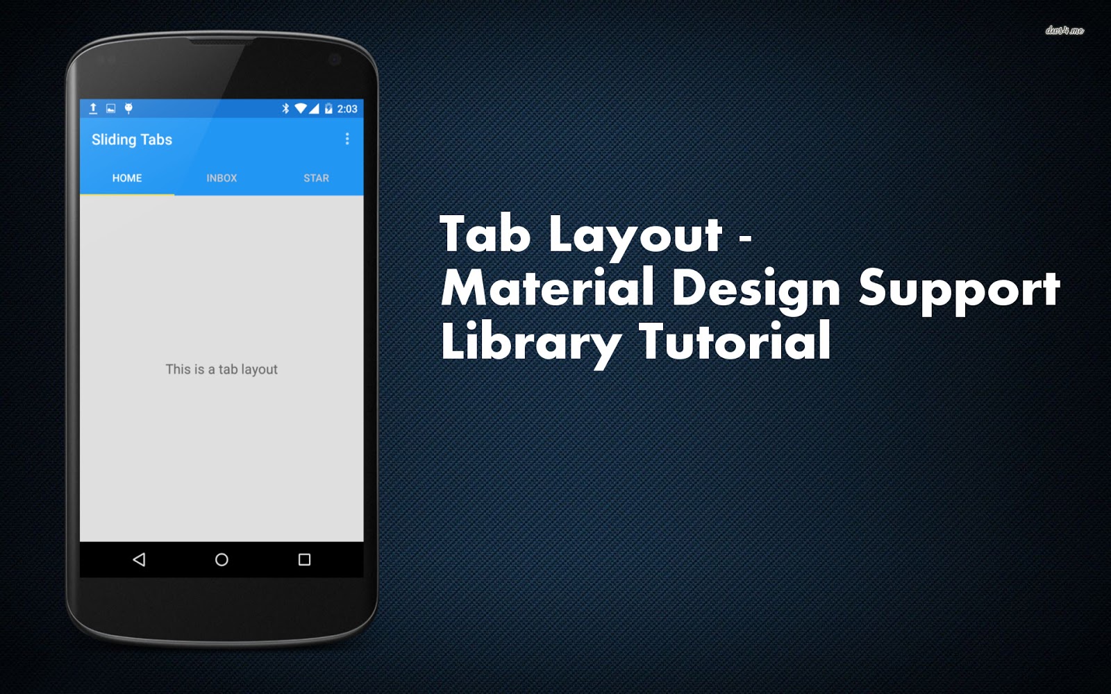
Material design support library provides a class called TabLayout which is basically a view class, required to be added into you layout for creating Sliding Tabs. Most of the times you are going to add this view below your toolbar because thats where you want your Tabs to be placed. Before staring out lets have a look at what we are trying to build up in this tutorial.

As you can see the tabs viz. Home, Inbox, Star are hold by Tab Layout which is placed right below the Toolbar, below the tab layout we have a view pager which is going to be linked with tab layout to achieve the desired effect.
2. Now we need to create a state list selector for the tabs text, this state list selector will define the text color of the tabs when they are selected and also define the default text color (When the tab is not the selected tab) So go to res folder and create a new folder named Color. Now create a new file inside this folder and name it tab_selector.xml and add the following lines to that file.
Here the lines which define the color of text when either selected, focused or pressed are as following
3. Now we need to define the style of our app for this project we are only going to define the color properties of our app, you can also define many other properties like text color, text type and font sizes and many more. To do that go to res->values->style.xml and add the following lines to your file. Again all this has been explained previously in my Toolbar tutorial.
4. Now time to set up out tabs in our layout go to res->layout->activity_main.xml and add the following lines of code in your file. All we are doing here is basically we are having a relative layout as our root view inside which we are adding Toolbar, below Toolbar we have our Tab Layout and below Tab Layout we have ViewPager. We are setting the background color of the tabs to the primary color which is blue. The same color has been setup for toolbar as well.
5. Now lets define how a single tabs content will look like, As you have seen we are not going to do anything fancy we are just having a simple text which says "Hello, This is a tab layout" which is placed in middle of the the screen. So go to res->layout and create a new layout name it tabs.xml and add the following lines of code to it.
6. Now we are pretty much done with the design part of the app so we can start coding it now. First of all we have added a view pager in the layout so we need to create a fragment which this view pager will hold. We are going to have three tabs but for ease of this tutorial I am only going to create one fragment which this view pager will hold and the same fragment will be shown when the tab changes. obviously you can create new fragment and add different content in them as per your requirement. We have already created the layout for the fragment (tabs.xml) now we need to code it so go to java->[package name] and create a new java class and name it TabFragment.java and add the following lines of code to that file.
7. Now as we have a view pager, we need to create an adapter for the view pager, So go to java->[package name] and create a new java class, name it ViewPagerAdapter.java and add the following lines of code to it. [Read the comments in the code bellow to understand whats happening]
9. Now if you run the project you would have a working demo of sliding tabs as shown below.

10. Now many a times you wont be needing text on tabs but you would be needing icons in place of text, Well with the TabLayout thats very easy to add as well. So to get Icons instead of text first of all copy paste your icons into your projects drawable folder, I have downloaded
ic_home_grey.png,
ic_inbox_grey.png
ic_star_grey.png
ic_home_white.png
ic_inbox_white.png
ic_star_white.png
grey icon for non selected tab and white for selected tab. I copy pasted all 6 icons in my project
11. Now open up MainActivity and Replace the following line of code
with the code below
First Icon (Home) is set to white and rest to grey because by default home tab will be selected when app is going to open up.
12. Now I need to change the icons as soon as some other tab is selected by the user, for that we add a onPageListner to the ViewPager and in the method onPageSelected we change the icons appropriately. To do this open up your main activity and add the following code to it. So MainActivity.java for tabs with icon looks something like this.
13. Now If you run the app you would get your app running and it would look like this.

14. So with that we have a working sliding tabs demo with text as well as icons.
Bonus Tip
1. When creating your ViewPagerAdapter.java you can ovverride the getPageTitle(int Positon) method something like following
Let Us Understand Sliding Tabs/ Tab Layout

As you can see the tabs viz. Home, Inbox, Star are hold by Tab Layout which is placed right below the Toolbar, below the tab layout we have a view pager which is going to be linked with tab layout to achieve the desired effect.
Steps To Build Sliding Tabs With Tab Layout
1. Open Android studio and create a new blank project, after your project has been created go to the res->values folder and create a new file named color.xml. Add the following lines to that file, everything about those colors have been explained in my Toolbar tutorial. The property with name "indicator" is used to define the color of the indicator line below the tabs. which we will set appropriately to the indicator while we code.
<?xml version="1.0" encoding="utf-8"?>
<resources>
    <color name="PrimaryColor">#2196F3</color>
    <color name="PrimaryDarkColor">#1976D2</color>
    <color name="indicator">#ecd95a</color>

</resources>
2. Now we need to create a state list selector for the tabs text, this state list selector will define the text color of the tabs when they are selected and also define the default text color (When the tab is not the selected tab) So go to res folder and create a new folder named Color. Now create a new file inside this folder and name it tab_selector.xml and add the following lines to that file.
<?xml version="1.0" encoding="utf-8"?>
<selector xmlns:android="http://schemas.android.com/apk/res/android">
        <item android:state_selected="true" android:color="@android:color/white" />
        <item android:state_focused="true" android:color="@android:color/white" />
        <item android:state_pressed="true" android:color="@android:color/white" />
        <item android:color="#d1c9c9" />
</selector>
Here the lines which define the color of text when either selected, focused or pressed are as following
<item android:state_selected="true" android:color="@android:color/white" />
<item android:state_focused="true" android:color="@android:color/white" />
<item android:state_pressed="true" android:color="@android:color/white" />
And the line below defines the default color for the text on tabs.<item android:color="#d1c9c9" />
3. Now we need to define the style of our app for this project we are only going to define the color properties of our app, you can also define many other properties like text color, text type and font sizes and many more. To do that go to res->values->style.xml and add the following lines to your file. Again all this has been explained previously in my Toolbar tutorial.
<resources>
    <!-- Base application theme. -->
    <style name="AppTheme" parent="Theme.AppCompat.Light.NoActionBar">
        <item name="colorPrimary">@color/PrimaryColor</item>
        <item name="colorPrimaryDark">@color/PrimaryDarkColor</item>
        <!-- Customize your theme here. -->
    </style>
</resources>
4. Now time to set up out tabs in our layout go to res->layout->activity_main.xml and add the following lines of code in your file. All we are doing here is basically we are having a relative layout as our root view inside which we are adding Toolbar, below Toolbar we have our Tab Layout and below Tab Layout we have ViewPager. We are setting the background color of the tabs to the primary color which is blue. The same color has been setup for toolbar as well.
<RelativeLayout xmlns:android="http://schemas.android.com/apk/res/android"
    xmlns:tools="http://schemas.android.com/tools"
    android:layout_width="match_parent"
    android:background="#dfdfdf"
    android:layout_height="match_parent"
    tools:context=".MainActivity">

    <include
        android:id="@+id/tool_bar"
        layout="@layout/toolbar"/>

    <android.support.design.widget.TabLayout
        android:id="@+id/tabs"
        android:layout_width="match_parent"
        android:layout_height="wrap_content"
        android:background="@color/PrimaryColor"
        android:layout_below="@+id/tool_bar"
        android:layout_alignParentLeft="true"
        android:layout_alignParentStart="true" />

    <android.support.v4.view.ViewPager
        android:id="@+id/viewpager"
        android:layout_width="match_parent"
        android:layout_height="match_parent"
        android:layout_below="@+id/tabs"
        />

</RelativeLayout>
5. Now lets define how a single tabs content will look like, As you have seen we are not going to do anything fancy we are just having a simple text which says "Hello, This is a tab layout" which is placed in middle of the the screen. So go to res->layout and create a new layout name it tabs.xml and add the following lines of code to it.
<?xml version="1.0" encoding="utf-8"?>
<RelativeLayout xmlns:android="http://schemas.android.com/apk/res/android"
    android:layout_width="match_parent"
    android:layout_height="match_parent"
    android:orientation="vertical">

    <TextView
        android:layout_width="wrap_content"
        android:layout_height="wrap_content"
        android:textAppearance="?android:attr/textAppearanceMedium"
        android:text="This is a tab layout"
        android:id="@+id/textView"
        android:layout_centerVertical="true"
        android:layout_centerHorizontal="true" />
</RelativeLayout>
6. Now we are pretty much done with the design part of the app so we can start coding it now. First of all we have added a view pager in the layout so we need to create a fragment which this view pager will hold. We are going to have three tabs but for ease of this tutorial I am only going to create one fragment which this view pager will hold and the same fragment will be shown when the tab changes. obviously you can create new fragment and add different content in them as per your requirement. We have already created the layout for the fragment (tabs.xml) now we need to code it so go to java->[package name] and create a new java class and name it TabFragment.java and add the following lines of code to that file.
package com.android4devs.slidingtabs;

import android.os.Bundle;
import android.support.v4.app.Fragment;
import android.view.LayoutInflater;
import android.view.View;
import android.view.ViewGroup;

/**
 * Created by Admin on 11-12-2015.
 */
public class TabFragment extends Fragment {
    @Override
    public View onCreateView(LayoutInflater inflater, ViewGroup container, Bundle savedInstanceState) {
        return inflater.inflate(R.layout.tabs, container, false);
    }
}
7. Now as we have a view pager, we need to create an adapter for the view pager, So go to java->[package name] and create a new java class, name it ViewPagerAdapter.java and add the following lines of code to it. [Read the comments in the code bellow to understand whats happening]
package com.android4devs.slidingtabs;

import android.support.v4.app.Fragment;
import android.support.v4.app.FragmentManager;
import android.support.v4.app.FragmentStatePagerAdapter;

/**
 * Created by Admin on 11-12-2015.
 */
public class ViewPagerAdapter extends FragmentStatePagerAdapter {

    public ViewPagerAdapter(FragmentManager fm) {
        super(fm);
    }

    @Override
    public Fragment getItem(int position) {
        return new TabFragment();    // Which Fragment should be dislpayed by the viewpager for the given position
                                    // In my case we are showing up only one fragment in all the three tabs so we are
                                    // not worrying about the position and just returning the TabFragment
    }

    @Override
    public int getCount() {
        return 3;           // As there are only 3 Tabs
    }

}
8. Now we have everything in place to start coding our main activity, so go to java->[package-name]->MainActivity.java and add the following line of code to the file, [Read the comments in the file to understand whats happening]package com.android4devs.slidingtabs;
import android.content.Context;
import android.support.design.widget.TabLayout;
import android.support.v4.content.ContextCompat;
import android.support.v4.view.ViewPager;
import android.support.v7.app.AppCompatActivity;
import android.os.Bundle;
import android.support.v7.widget.Toolbar;
import android.view.Menu;
import android.view.MenuItem;
public class MainActivity extends AppCompatActivity {
//Declaring All The Variables Needed
private Toolbar toolbar;
private TabLayout tabLayout;
private ViewPager viewPager;
private ViewPagerAdapter viewPagerAdapter;
@Override
protected void onCreate(Bundle savedInstanceState) {
super.onCreate(savedInstanceState);
setContentView(R.layout.activity_main);
/*
Assigning view variables to thier respective view in xml
by findViewByID method
*/
toolbar = (Toolbar) findViewById(R.id.tool_bar);
tabLayout = (TabLayout) findViewById(R.id.tabs);
viewPager = (ViewPager) findViewById(R.id.viewpager);
/*
Creating Adapter and setting that adapter to the viewPager
setSupportActionBar method takes the toolbar and sets it as
the default action bar thus making the toolbar work like a normal
action bar.
*/
viewPagerAdapter = new ViewPagerAdapter(getSupportFragmentManager());
viewPager.setAdapter(viewPagerAdapter);
setSupportActionBar(toolbar);
/*
TabLayout.newTab() method creates a tab view, Now a Tab view is not the view
which is below the tabs, its the tab itself.
*/
final TabLayout.Tab home = tabLayout.newTab();
final TabLayout.Tab inbox = tabLayout.newTab();
final TabLayout.Tab star = tabLayout.newTab();
/*
Setting Title text for our tabs respectively
*/
home.setText("Home");
inbox.setText("Inbox");
star.setText("Star");
/*
Adding the tab view to our tablayout at appropriate positions
As I want home at first position I am passing home and 0 as argument to
the tablayout and like wise for other tabs as well
*/
tabLayout.addTab(home, 0);
tabLayout.addTab(inbox, 1);
tabLayout.addTab(star, 2);
/*
TabTextColor sets the color for the title of the tabs, passing a ColorStateList here makes
tab change colors in different situations such as selected, active, inactive etc
TabIndicatorColor sets the color for the indiactor below the tabs
*/
tabLayout.setTabTextColors(ContextCompat.getColorStateList(this, R.color.tab_selector));
tabLayout.setSelectedTabIndicatorColor(ContextCompat.getColor(this, R.color.indicator));
/*
Adding a onPageChangeListener to the viewPager
1st we add the PageChangeListener and pass a TabLayoutPageChangeListener so that Tabs Selection
changes when a viewpager page changes.
*/
viewPager.addOnPageChangeListener(new TabLayout.TabLayoutOnPageChangeListener(tabLayout));
}
@Override
public boolean onCreateOptionsMenu(Menu menu) {
// Inflate the menu; this adds items to the action bar if it is present.
getMenuInflater().inflate(R.menu.menu_main, menu);
return true;
}
@Override
public boolean onOptionsItemSelected(MenuItem item) {
// Handle action bar item clicks here. The action bar will
// automatically handle clicks on the Home/Up button, so long
// as you specify a parent activity in AndroidManifest.xml.
int id = item.getItemId();
//noinspection SimplifiableIfStatement
if (id == R.id.action_settings) {
return true;
}
return super.onOptionsItemSelected(item);
}
}
9. Now if you run the project you would have a working demo of sliding tabs as shown below.

10. Now many a times you wont be needing text on tabs but you would be needing icons in place of text, Well with the TabLayout thats very easy to add as well. So to get Icons instead of text first of all copy paste your icons into your projects drawable folder, I have downloaded
ic_home_grey.png,
ic_inbox_grey.png
ic_star_grey.png
ic_home_white.png
ic_inbox_white.png
ic_star_white.png
grey icon for non selected tab and white for selected tab. I copy pasted all 6 icons in my project
11. Now open up MainActivity and Replace the following line of code
home.setText("Home");
inbox.setText("Inbox");
star.setText("Star");
inbox.setText("Inbox");
star.setText("Star");
with the code below
home.setIcon(R.drawable.ic_home_white);
inbox.setIcon(R.drawable.ic_inbox_grey);
star.setIcon(R.drawable.ic_star_grey);
First Icon (Home) is set to white and rest to grey because by default home tab will be selected when app is going to open up.
12. Now I need to change the icons as soon as some other tab is selected by the user, for that we add a onPageListner to the ViewPager and in the method onPageSelected we change the icons appropriately. To do this open up your main activity and add the following code to it. So MainActivity.java for tabs with icon looks something like this.
package com.android4devs.slidingtabs;

import android.content.Context;
import android.support.design.widget.TabLayout;
import android.support.v4.content.ContextCompat;
import android.support.v4.view.ViewPager;
import android.support.v7.app.AppCompatActivity;
import android.os.Bundle;
import android.support.v7.widget.Toolbar;
import android.view.Menu;
import android.view.MenuItem;

public class MainActivity extends AppCompatActivity {

    //Declaring All The Variables Needed

    private Toolbar toolbar;
    private TabLayout tabLayout;
    private ViewPager viewPager;
    private ViewPagerAdapter viewPagerAdapter;


    @Override
    protected void onCreate(Bundle savedInstanceState) {
        super.onCreate(savedInstanceState);
        setContentView(R.layout.activity_main);

        /*
        Assigning view variables to thier respective view in xml
        by findViewByID method
         */

        toolbar = (Toolbar) findViewById(R.id.tool_bar);
        tabLayout = (TabLayout) findViewById(R.id.tabs);
        viewPager = (ViewPager) findViewById(R.id.viewpager);

        /*
        Creating Adapter and setting that adapter to the viewPager
        setSupportActionBar method takes the toolbar and sets it as
        the default action bar thus making the toolbar work like a normal
        action bar.
         */
        viewPagerAdapter = new ViewPagerAdapter(getSupportFragmentManager());
        viewPager.setAdapter(viewPagerAdapter);
        setSupportActionBar(toolbar);

        /*
        TabLayout.newTab() method creates a tab view, Now a Tab view is not the view
        which is below the tabs, its the tab itself.
         */

        final TabLayout.Tab home = tabLayout.newTab();
        final TabLayout.Tab inbox = tabLayout.newTab();
        final TabLayout.Tab star = tabLayout.newTab();

        //Setting Icons to our respective tabs

        home.setIcon(R.drawable.ic_home_white);
        inbox.setIcon(R.drawable.ic_inbox_grey);
        star.setIcon(R.drawable.ic_star_grey);

        /*
        Adding the tab view to our tablayout at appropriate positions
        As I want home at first position I am passing home and 0 as argument to
        the tablayout and like wise for other tabs as well
         */
        tabLayout.addTab(home, 0);
        tabLayout.addTab(inbox, 1);
        tabLayout.addTab(star, 2);

        /*
        TabTextColor sets the color for the title of the tabs, passing a ColorStateList here makes
        tab change colors in different situations such as selected, active, inactive etc

        TabIndicatorColor sets the color for the indiactor below the tabs
         */

        tabLayout.setTabTextColors(ContextCompat.getColorStateList(this, R.color.tab_selector));
        tabLayout.setSelectedTabIndicatorColor(ContextCompat.getColor(this, R.color.indicator));

        /*
        Adding a onPageChangeListener to the viewPager
        1st we add the PageChangeListener and pass a TabLayoutPageChangeListener so that Tabs Selection
        changes when a viewpager page changes.

        2nd We add the onPageChangeListener to change the icon when the page changes in the view Pager
         */

        viewPager.addOnPageChangeListener(new TabLayout.TabLayoutOnPageChangeListener(tabLayout));
        viewPager.addOnPageChangeListener(new ViewPager.OnPageChangeListener() {
            @Override
            public void onPageScrolled(int position, float positionOffset, int positionOffsetPixels) {

            }

            @Override
            public void onPageSelected(int position) {
                switch (position){
                    case 0:
                        /*
                        setting Home as White and rest grey
                        and like wise for all other positions
                         */
                        home.setIcon(R.drawable.ic_home_white);
                        inbox.setIcon(R.drawable.ic_inbox_grey);
                        star.setIcon(R.drawable.ic_star_grey);
                        break;
                    case 1:
                        home.setIcon(R.drawable.ic_home_grey);
                        inbox.setIcon(R.drawable.ic_inbox_white);
                        star.setIcon(R.drawable.ic_star_grey);
                        break;
                    case 2:
                        home.setIcon(R.drawable.ic_home_grey);
                        inbox.setIcon(R.drawable.ic_inbox_grey);
                        star.setIcon(R.drawable.ic_star_white);
                        break;
                }
            }

            @Override
            public void onPageScrollStateChanged(int state) {

            }
        });

    }

    @Override
    public boolean onCreateOptionsMenu(Menu menu) {
        // Inflate the menu; this adds items to the action bar if it is present.
        getMenuInflater().inflate(R.menu.menu_main, menu);
        return true;
    }

    @Override
    public boolean onOptionsItemSelected(MenuItem item) {
        // Handle action bar item clicks here. The action bar will
        // automatically handle clicks on the Home/Up button, so long
        // as you specify a parent activity in AndroidManifest.xml.
        int id = item.getItemId();

        //noinspection SimplifiableIfStatement
        if (id == R.id.action_settings) {
            return true;
        }

        return super.onOptionsItemSelected(item);
    }
}
13. Now If you run the app you would get your app running and it would look like this.
14. So with that we have a working sliding tabs demo with text as well as icons.
Bonus Tip
1. When creating your ViewPagerAdapter.java you can ovverride the getPageTitle(int Positon) method something like following
@Overridepublic CharSequence getPageTitle(int position) {
    switch (position){
        case 0:
            return "Home";
        case 1:
            return "Inbox";
        case 2:
            return "Star";
    }
    return "Default Text";
}
By doing so, your tabs would get title text from this method instead of setting them like
home.setText("Home");
inbox.setText("Inbox");
star.setText("Star");
2. Sometimes you might want to have icons and text or some other wired combination as your tab, well with the new library even thats possible, Lets say I want to have a Icon and TextView Below the icon and I want the TextView Bold well . So all I do is create a new layout file name it custom_view.xml add the following line of code to it
<?xml version="1.0" encoding="utf-8"?>
<LinearLayout xmlns:android="http://schemas.android.com/apk/res/android"
    android:layout_width="match_parent"
    android:layout_height="wrap_content"
    android:orientation="vertical">

    <ImageView
        android:id="@+id/imageView"
        android:layout_width="20dp"
        android:layout_height="20dp"
        android:layout_gravity="center_horizontal"
        />

    <TextView
        android:id="@+id/textView2"
        android:layout_width="wrap_content"
        android:layout_height="wrap_content"
        android:layout_gravity="center_horizontal"
        android:textSize="16sp"
        android:textStyle="bold" />

</LinearLayout>
Now All I need to do is set this layout to the Tabs we created in the MainActivity.xml, lets say I want to set this layout as the tab view to the home tab so I remove setIcon() method and add a setCustomView() method to the tab and this layout gets added to the tab. Now ofcourse you need to inflate the view in a view object something like the following before you set the view to the tabs to have a appropriate icon and text set to all the tabs here is the part of the code you need to add in your main activity
        View HomeView = getLayoutInflater().inflate(R.layout.coustom_view,null);
        ImageView iconHome = (ImageView) HomeView.findViewById(R.id.imageView);
        TextView textView = (TextView) HomeView.findViewById(R.id.textView2);
        iconHome.setImageResource(R.drawable.ic_home_grey);
        textView.setText("Home");

        View InboxView = getLayoutInflater().inflate(R.layout.coustom_view,null);
        ImageView iconIn = (ImageView) InboxView.findViewById(R.id.imageView);
        TextView textViewIn = (TextView) InboxView.findViewById(R.id.textView2);
        iconIn.setImageResource(R.drawable.ic_inbox_grey);
        textViewIn.setText("Inbox");

        View StarView = getLayoutInflater().inflate(R.layout.coustom_view,null);
        ImageView iconStar = (ImageView) StarView.findViewById(R.id.imageView);
        TextView textViewStar = (TextView) StarView.findViewById(R.id.textView2);
        iconStar.setImageResource(R.drawable.ic_inbox_grey);
        textViewStar.setText("Star");

        home.setCustomView(HomeView);
        inbox.setCustomView(InboxView);
        star.setCustomView(StarView);

        tabLayout.addTab(home, 0);
        tabLayout.addTab(inbox, 1);
        tabLayout.addTab(star, 2);
If you run the app with the above changes here is the result you would get

I dont know if you can call this as a tip but thats a option available while working with the TabLayout as a blogger providing tutorials I want reader to know all that I understand. Hope you like the tutorial, Subscribe to mail list and Keep Coding.


