.png)
How To Make Node.Js Backend For Facebook Messenger Chat Bot
This is in continuation from the previous post How To Make Facebook Messenger Chat Bot With Api.ai, In the previous post we had created an Api.ai chat bot agent and hooked it up to Facebook Messenger which could converse and extract some parameters from the conversation according to our needs, In this section we are going to create a backend in Node.js which would take those parameters and query TheMovieDb database and provide response to our chat bot.
1. Latest version on Node.js installed on your machine.
2. Chrome Extension Postman for testing (Optional).
3. Sublime text editor or any other works.

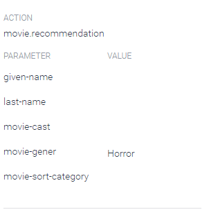
Action - (Which gives you the intent)
So our backend would get a request along with this data our backend would extract the values it needs and provide a response
Understanding The Response Required

we would use the above IDs in our Backend while sending the request to for movie recommendation.
Requirements
2. Chrome Extension Postman for testing (Optional).
3. Sublime text editor or any other works.
4. Git client installed for deploying our backend to cloud.
Understanding Request From API.AI
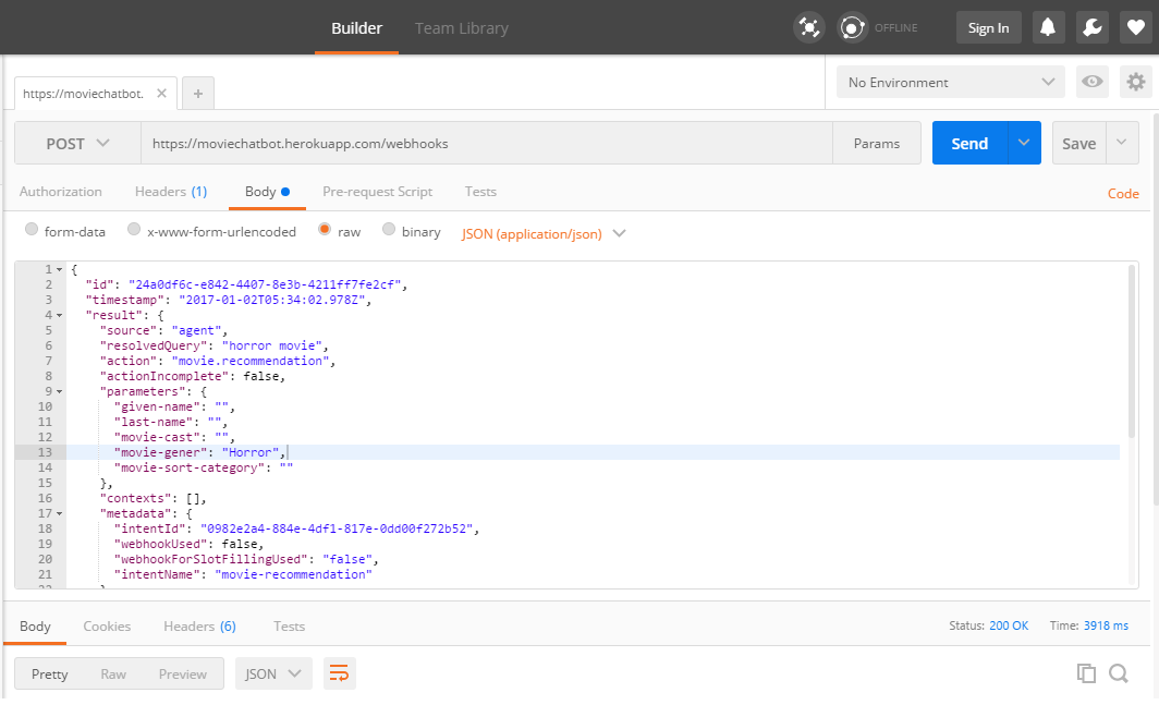
Connecting your Api.ai agent to your backend means having an intermediate webhook which would get a request from your agent whenever a intent is triggered. When intent is triggered Api.ai would send a request to our backend along with json of parameters it extracted from the conversation of you use the try it now console of Api.ai Agent we created then when an intent is triggered you can see a button at the bottom which says Show Json

,
By clicking on Show JSON you would be able to view the JSON format API.AI would be sending to our backend, so lets have a look at the format.
If you have a look you can see that from the above JSON you can extract the intent and parameter values from the results object
Within results you have a value named
Within results you have a value named
Action - (Which gives you the intent)
Parameters - (JSON object which would provide you the parameter values required)
So our backend would get a request along with this data our backend would extract the values it needs and provide a response
Understanding The Response Required


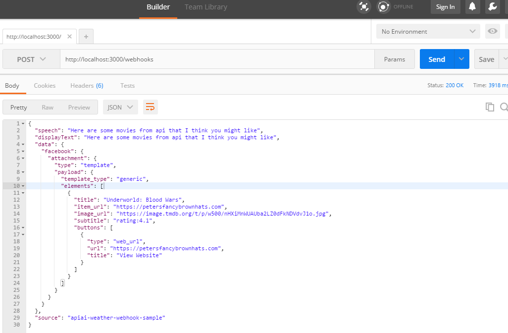
We need to send the response for movie recommendation in the format as shown above, facebook provides different formats in which we can display data the above format which you see is called as a generic template and our backend needs to define it in JSON format as described here on facebook messenger documentation page for generic templates
So when the request from API.AI would hit our backend it should perform following functions.
1 . Extract the parameters and Intent
2. Use the parameters value to query TheMovideDb
2. Use the parameters value to query TheMovideDb
3 .Get the response from TheMovieDb,
4. Create a JSON format for response using the response from Movie DB
So our final response which would be shown to have a view shown in messenger as shown above would look something as shown below.
4. Create a JSON format for response using the response from Movie DB
So our final response which would be shown to have a view shown in messenger as shown above would look something as shown below.
Understanding TheMovieDb.org API
Lets now have a look at TheMovieDb.org Api which we would be using to get movie recommendations.
Step 1. First of all go to https://www.themoviedb.org and sign up for an account and login in, click on API in the side menu to get your secret key as shown in the below image
Step 2. Now if you go the the API documentation for the TheMovieDb you could see there is one api available to fetch movie by genres, you can find documentation here https://developers.themoviedb.org/3/genres/get-movies-by-genre

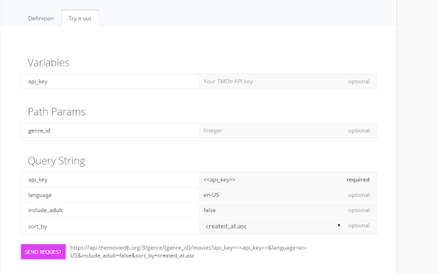
https://api.themoviedb.org/3/genre/{genre_id}/movies?api_key=<<api_key>>&language=en-US&include_adult=false&sort_by=created_at.asc
As you can see this API requires you to provide the API key as a variable along with the genre ID for which you want to fetch the movie plus there are few query strings as shown above we wont bother about that now,
API Key - Its the key you got when you signed up.
Genres ID - Every genre has one ID associated with it which we have to send to this api when we query it for the movie.
We can get the complete list of movie genres from the following URL
Add your API Key in the url and you would get a response as shown below.
we would use the above IDs in our Backend while sending the request to for movie recommendation.
Steps To Build Your Node.js Backend
So now that we know our request and response format lets start building our backend in Node.Js
Step 1. Install Node.js from https://www.nodejs.org. After you have that installed you should create a new folder anywhere on your machine and name it "Node Projects", this is the parent folder in which we would be creating our projects.
Step 2. Now you need to install express framework for node as a global variable so you can access express commands from anywhere on you machine to do that run the following command.
Step 3. Now open Node Projects folder and fire up command prompt (cmd) within that folder. You can do that by pressing shift key and left clicking inside the folder (Node Projects) and selecting open command window here on windows. Once you have the cmd open type in the following command.
Step 2. Now you need to install express framework for node as a global variable so you can access express commands from anywhere on you machine to do that run the following command.
$ npm install express --save
Step 3. Now open Node Projects folder and fire up command prompt (cmd) within that folder. You can do that by pressing shift key and left clicking inside the folder (Node Projects) and selecting open command window here on windows. Once you have the cmd open type in the following command.
$express MovieBot
We are using express command as we are going to use express framework for building our node app and we are specifing the name of the project as MovieBotThis will create a new folder in your Node Projects folder named MovieBot which would be a node app with express set up this is like starting point provided for you by express framework.
Step 4. Now run the following command
$ cd MovieBot && npm install
Step 5. At this point we have our initial set up ready and you can test if you have done everything write by running the following command.
$ npm start
If everything is done right you wont see any errors, Now without closing the command prompt open your browser and go to
(by default node.js runs on port 3000) now you would be able to see a web page saying
welcome to express.

Congratulations we have our initial set up, up and running properly. now we can thrown in our logic and start implementing our Restful backend.
Step 6. Now before we start I would like to explain few concepts in node.js and express framework and would like to let you know how the file structure is in express node app. If you open your folder MovieBot, You would see a following file stracture
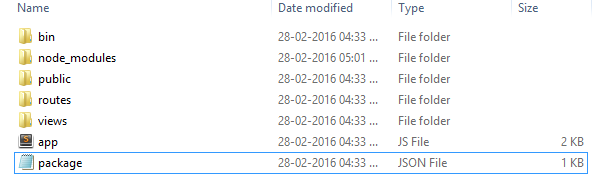
so blog and contacts are two routes of our base url and we can define what should happen when the request comes in for this routes in our routes folder by creating appropriate JS files and linking them to the route in the app.js
First, we are creating a variable to access our routes created in our routes folder, Right now we have two routes in our routes folder viz. index.js and user.js .
Then we are defining which url would be handled by which route.
so on line 25 of app.js we are defining that all the requests to "/" (root url) would be handled by index.js route which has be accessed in a variable routes.
and on line 26 we are defining that all the requests to "/users" url would be handled by user.js route.
now go ahead and visit http://localhost:3000/users, you would see a page saying "respond with resources" now /users url has been defined to be handled by users.js route so have a look at the users.js file now. you would see something like this.
Now lets understand whats happening here, First we have a function.
Function : router.get()
Parameters :
1. location/url - Which url would this get request would be handling
2. Request Handler function - function(req, res, next)
req - holds the incoming request
res - Is used to provide response to the requests.
Now If you go ahead and add a new route in users.js as following
Now if you go to http://localhost:3000/users/hello you would be able to see a web page saying "Hello World"
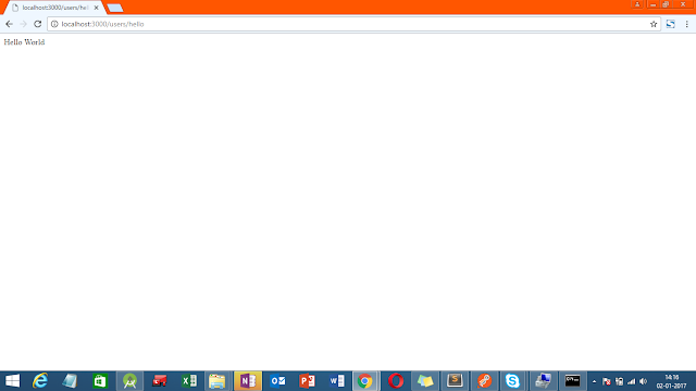
Note - Notice that you are going to http://localhost:3000/users/hello not http://localhost:3000/hello this is because you have defined the route in user.js file which we have have defined in app.js to handle the http://localhost:3000/users url
we just created a route to handle a get request at a specific url. Similarly you can handle different requests with the router, which are
1. Get - router.get()
2. Post - router.post()
3. Delete - router.delete()
4. Update - router.update()
Now that we know about the structure and format lets start building our backend please have a look at the comments in the code for better understanding.
Step 7. Open app.js and the lines at number 10 and 28. We have defined a new route webhooks and we have mapped it to the url /webhooks in relation to our base URL.
Step 8. Now open your your routes folder and add webhooks.js file as shown below this is where we are going to handle our API.AI incoming requests and provide a response. Read the comments for better understanding.
Now lets test our app locally, open cmd at your root folder of the express app we created and run the following command
Now to test our backend we need a chrome app called PostMan you can search and download it after you have downloaded it open up chrome browser and start postmanStep 6. Now before we start I would like to explain few concepts in node.js and express framework and would like to let you know how the file structure is in express node app. If you open your folder MovieBot, You would see a following file stracture

Let me explain you the the important files with respect to this tutorial, First of all we have
app.js - This file is like the main function of any program, It Handles the incoming requests and does appropriate routing to our routes
routes - Routes folder holds the JS files for different url requests,
Lets say we have a base url www.example.com.
Now lets say this website has a blog at www.example.com/blog
It also has a contact page at www.example.com/contact
so blog and contacts are two routes of our base url and we can define what should happen when the request comes in for this routes in our routes folder by creating appropriate JS files and linking them to the route in the app.js
views - Routes files uses this views files to show in the content in HTML formatted web page, as we are building Restfull api and providing output in JSON we are not concerned about views in this tutorial
Rest of the folders are self explanatory.
Now if you open app.js you would see a file like this, Go through the comments of the file below to understand whats happening
Here we are interested in line no 8, 9 & 25, 26. Have a look at those lines here is what you would see.First, we are creating a variable to access our routes created in our routes folder, Right now we have two routes in our routes folder viz. index.js and user.js .
Then we are defining which url would be handled by which route.
so on line 25 of app.js we are defining that all the requests to "/" (root url) would be handled by index.js route which has be accessed in a variable routes.
and on line 26 we are defining that all the requests to "/users" url would be handled by user.js route.
now go ahead and visit http://localhost:3000/users, you would see a page saying "respond with resources" now /users url has been defined to be handled by users.js route so have a look at the users.js file now. you would see something like this.
Function : router.get()
Parameters :
1. location/url - Which url would this get request would be handling
2. Request Handler function - function(req, res, next)
req - holds the incoming request
res - Is used to provide response to the requests.
Now If you go ahead and add a new route in users.js as following
Now if you go to http://localhost:3000/users/hello you would be able to see a web page saying "Hello World"

Note - Notice that you are going to http://localhost:3000/users/hello not http://localhost:3000/hello this is because you have defined the route in user.js file which we have have defined in app.js to handle the http://localhost:3000/users url
we just created a route to handle a get request at a specific url. Similarly you can handle different requests with the router, which are
1. Get - router.get()
2. Post - router.post()
3. Delete - router.delete()
4. Update - router.update()
Now that we know about the structure and format lets start building our backend please have a look at the comments in the code for better understanding.
Step 7. Open app.js and the lines at number 10 and 28. We have defined a new route webhooks and we have mapped it to the url /webhooks in relation to our base URL.
Step 8. Now open your your routes folder and add webhooks.js file as shown below this is where we are going to handle our API.AI incoming requests and provide a response. Read the comments for better understanding.
Now lets test our app locally, open cmd at your root folder of the express app we created and run the following command
$ npm start
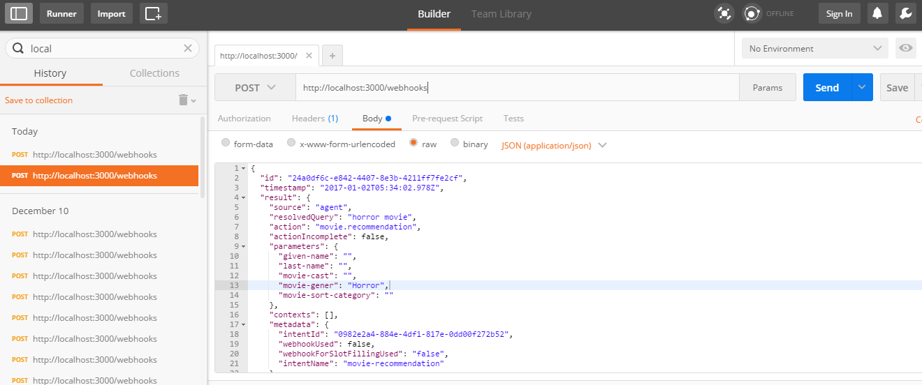
Now select the request type as POST and type in the URL - www.localhost.com:3030/webhooks
In the body section copy paste the JSON we are expecting API.ai to send use when it triggers a movie recommendation.(This is for testing purpose)
Now hit send, if you get the appropriate response as shown below it means our backend is working appropriately
.
Congratulations, If you have got this working you have successfully built the backend for our Chat bot
Now we just have to upload our backend to a cloud hosting provider, I have decided to go with Heroku as it is easy to set up and has a great support
Uploading The Chat Bot To Heroku Cloud.
Step 1. Log on to Heroku and Sign up
Step 2. Log in and hit create a new app button

Step 3. Hit Create App now you would be taken to the page as shown below follow the instructions on this page to deploy your backend to heroku

Step 4. Download Heroku CLI (Heroku Command Line) and Go to our backend MovieBot folder and open cmd at this location and follow the command as show in the image above
Step 5. Now If you have followed everything appropriately then you can go to post man as we did priviously but instead of checkin on local host now add in your heroku app url https://moviechatbot.herokuapp.com/webhooks and keeping all other things same hit send.
Now you can see the response would be provided as shown below.
This confirms our Heroku cloud is running our backend successfully.Now we just have to enable fulfillment option at our API.AI agent.
Enabling Fulfillment in API.AI agent.
Step 1. Go To API.AI dashboard and click on fulfillment tab on the left hand side and enable the webhooks option as shown in the image below.

Leave the authentication part empty, as we are not covering that in this tutorial as it would be out of scope to explain that. hit save
Step 2. Go to Intents section and click on the movie.recommendation intent we created, scroll down and enable

Hit save, Congratulations we have our Chat Bot ready, Go to your Facebook page and start a chat with the bot your bot would provide you recommendations as we had decided.

Please comment below if you are facing any issue as well as let me know your thoughts about chat bots.


